Bibaswan
I design enterprise systems
that people actually use.
Senior Product Designer (UX) specialising in complex B2B SaaS, multirole workflows, admin systems, dataheavy interfaces, and missioncritical platforms where design decisions have real operational consequences.
Projects that
moved the needle
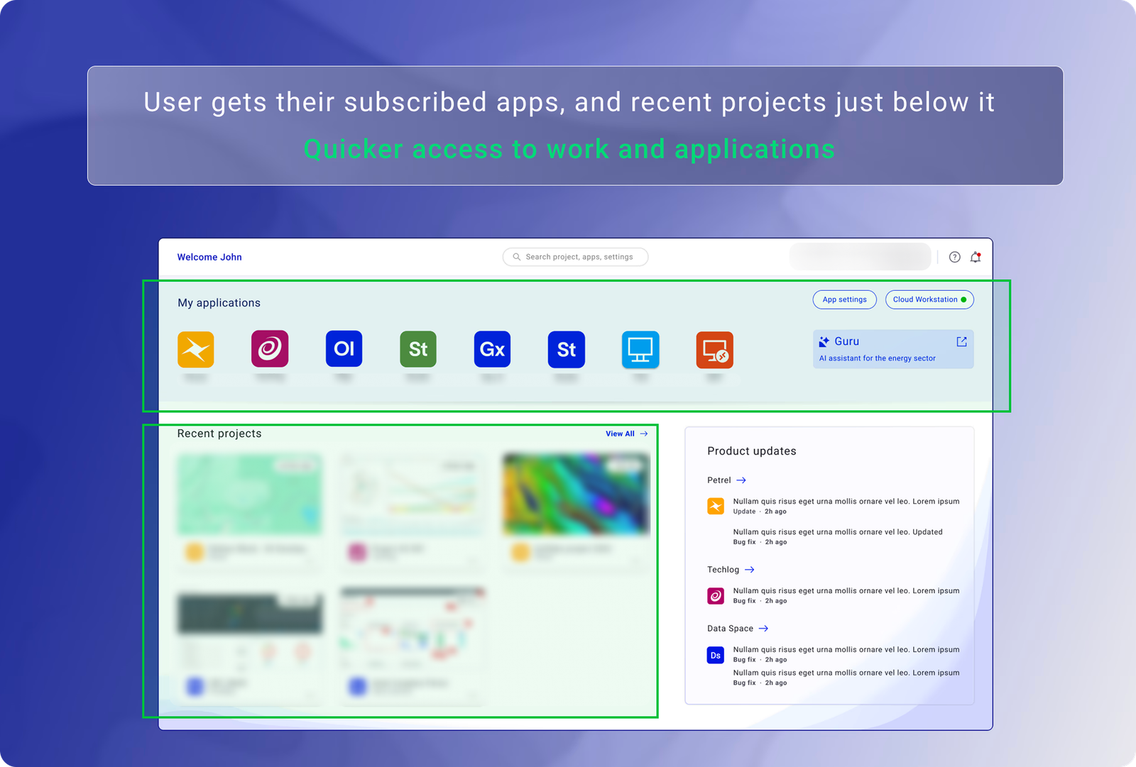
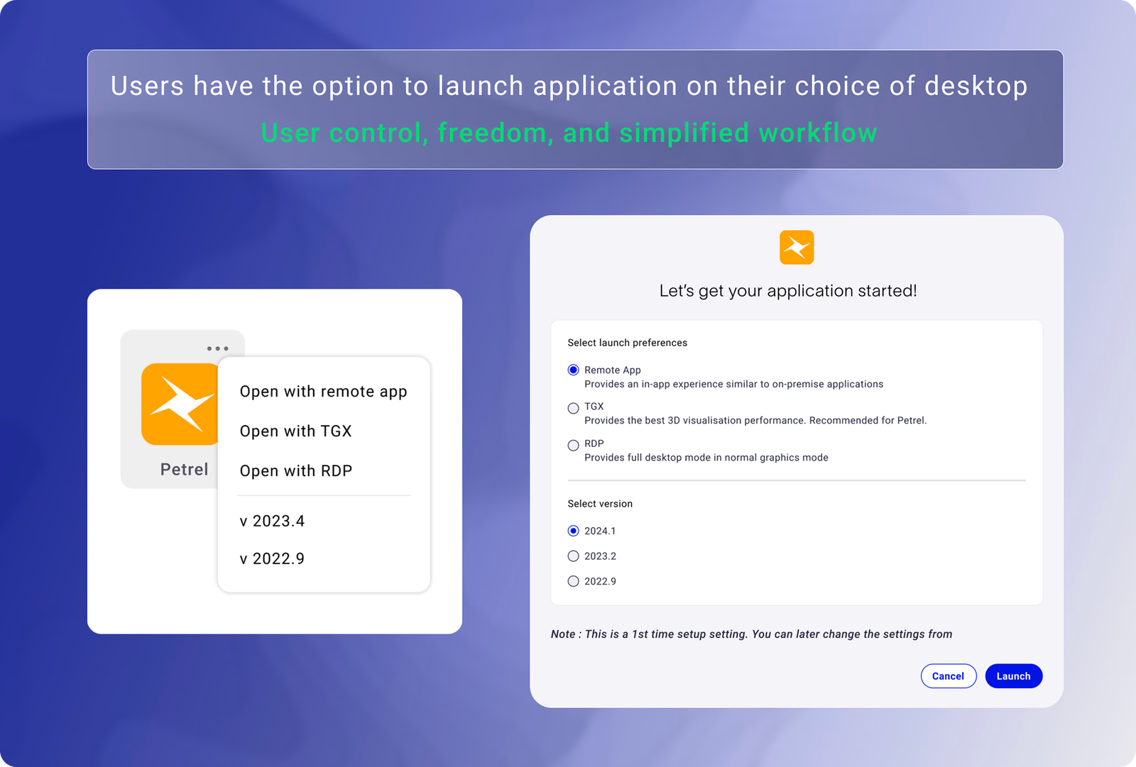
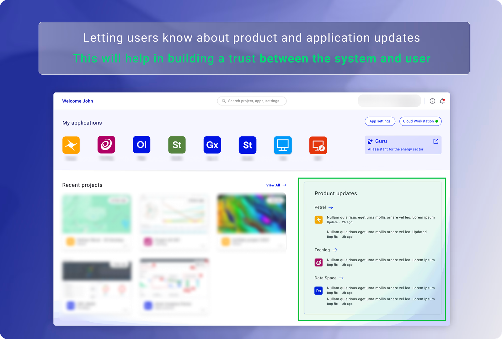
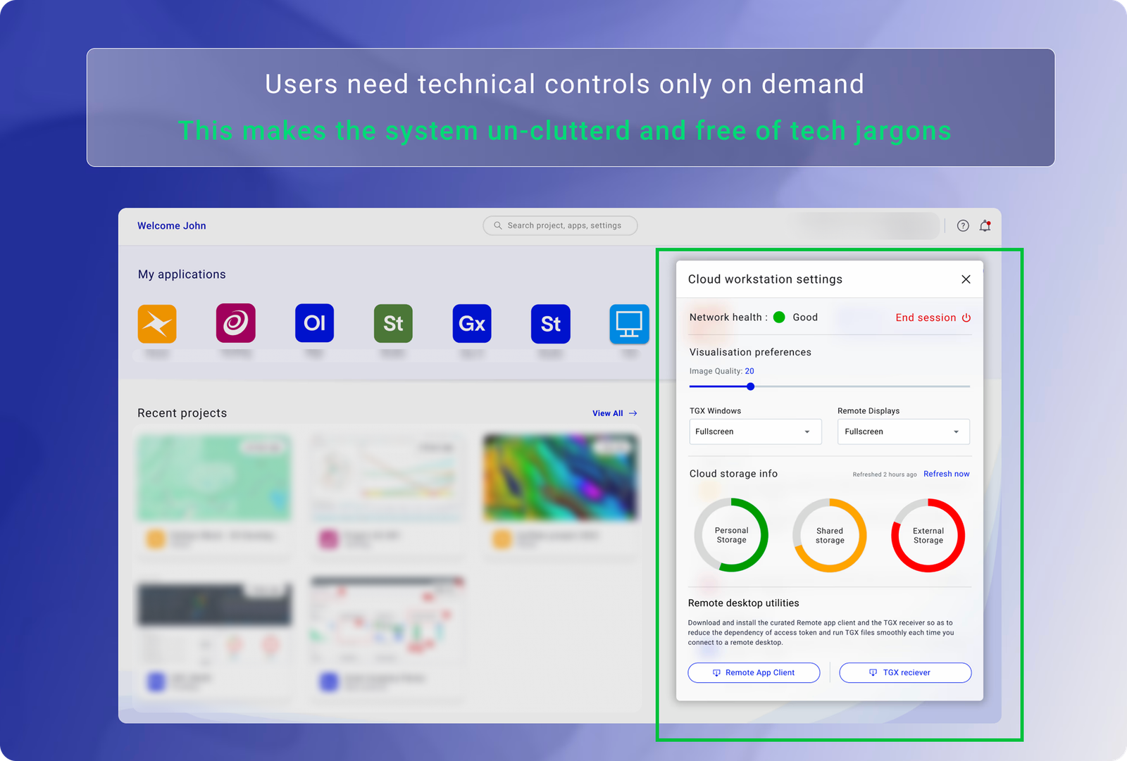
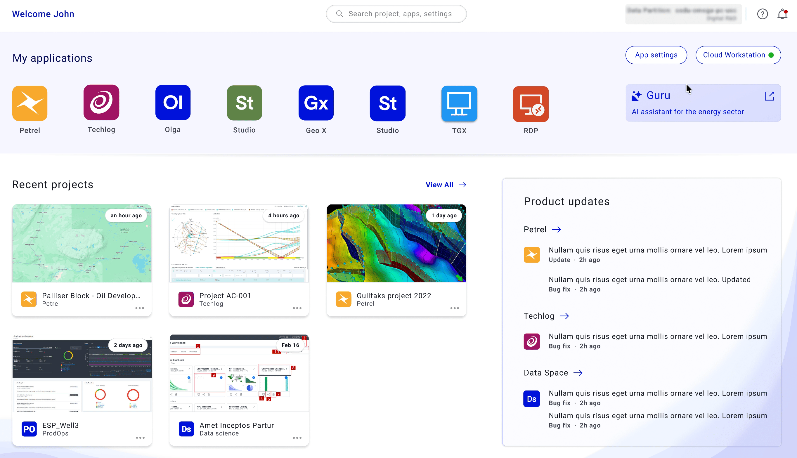
Reducing Enterprise
Workspace Friction
by 67%
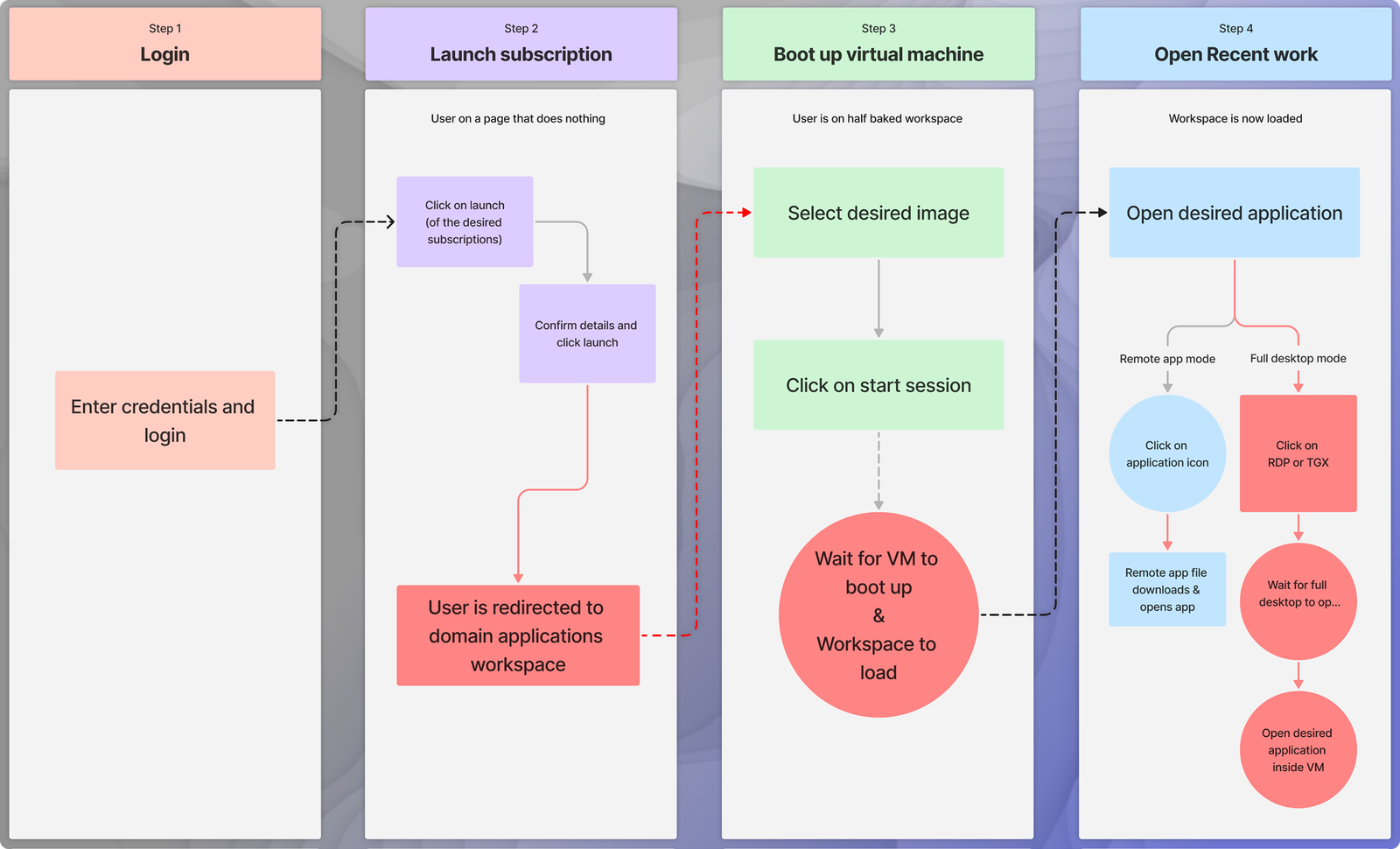
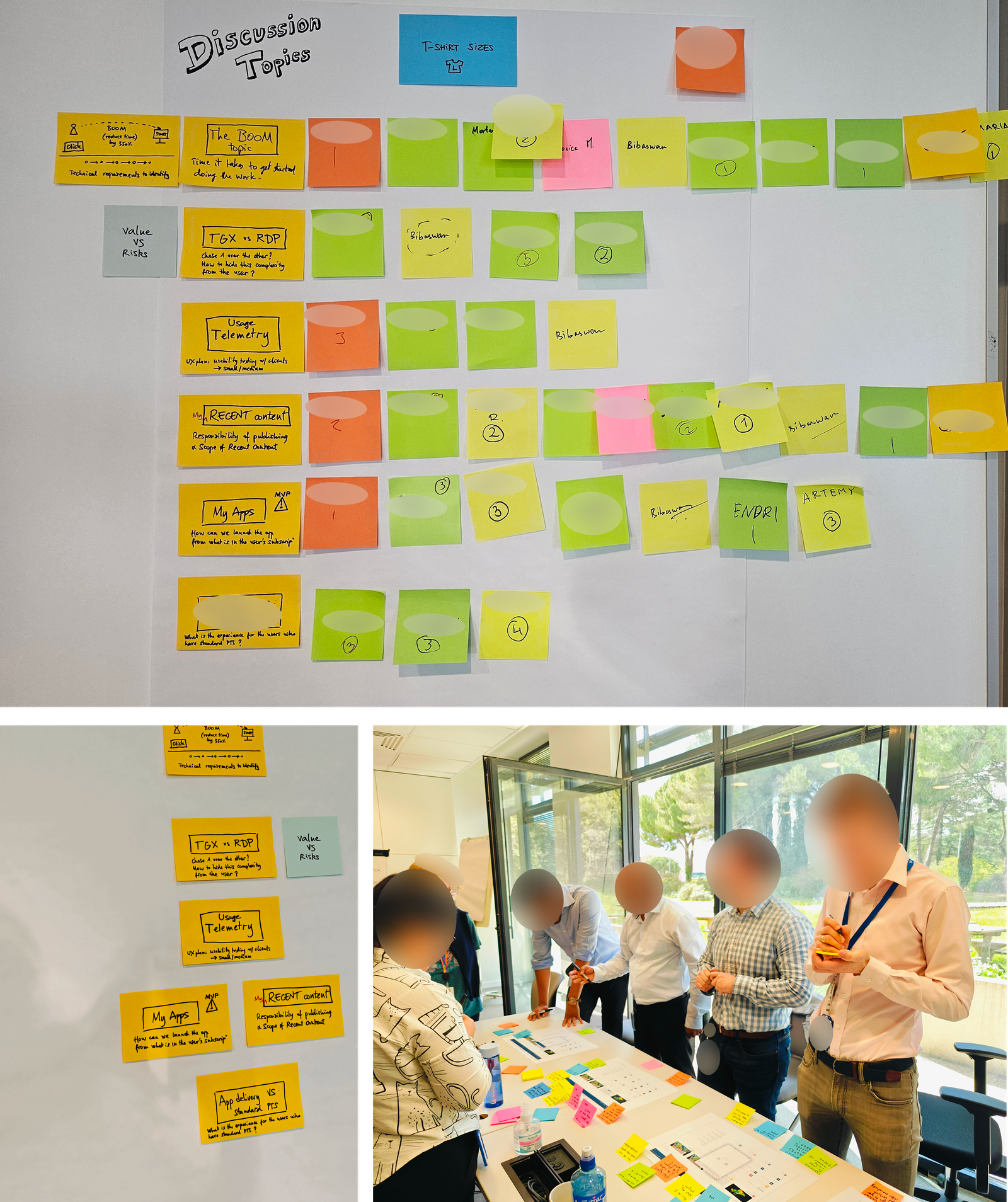
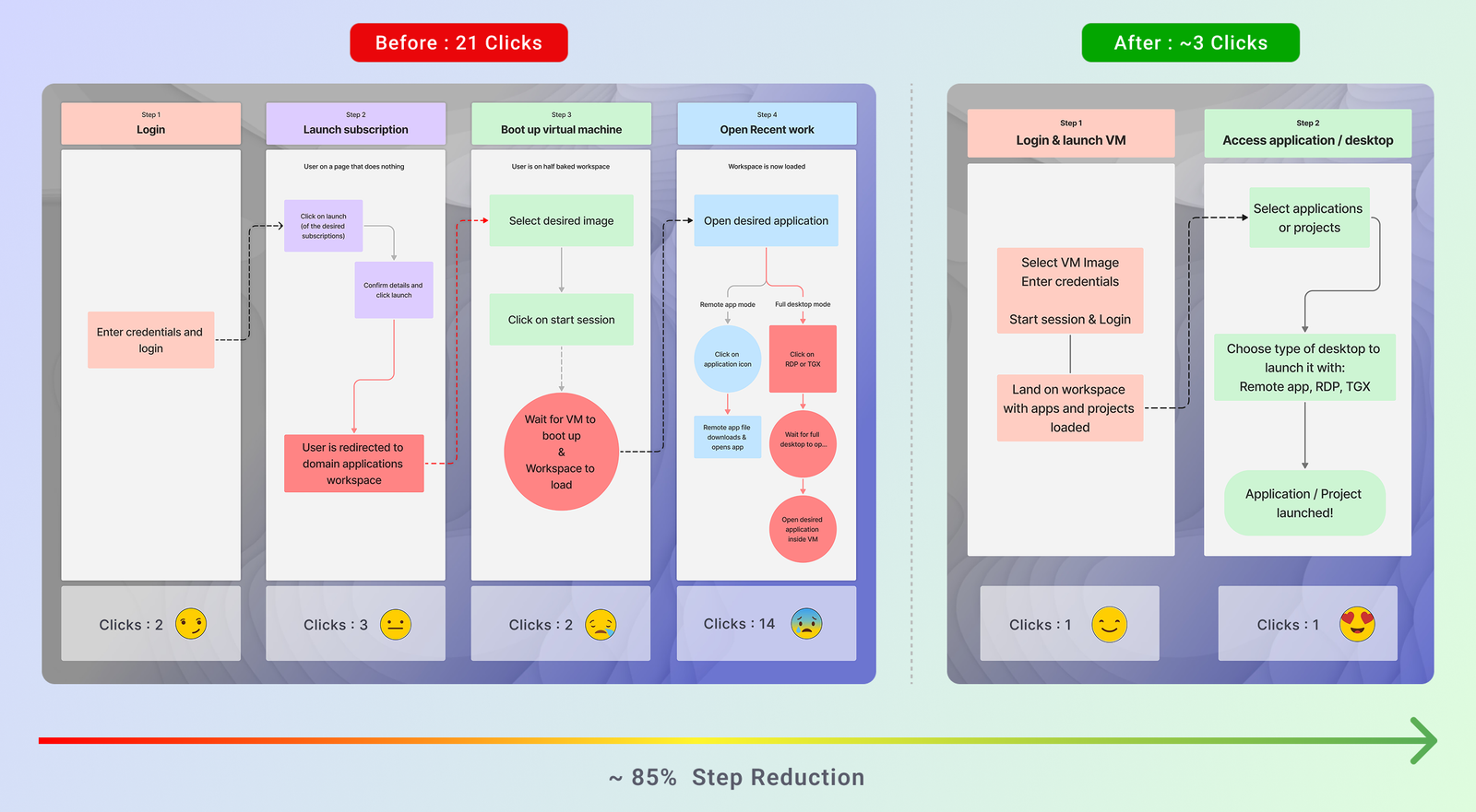
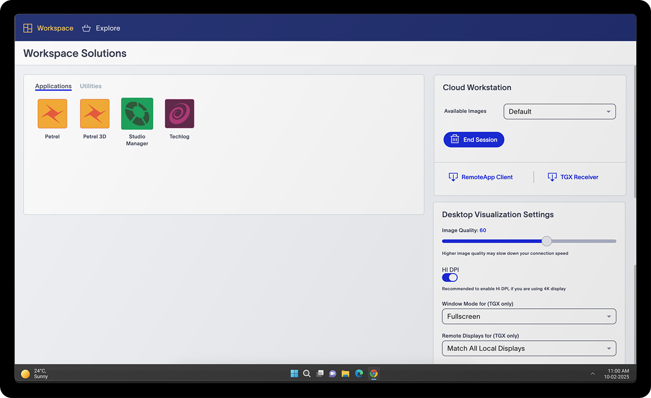
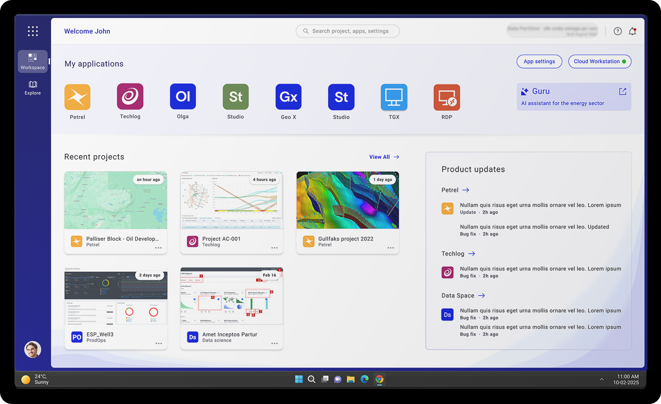
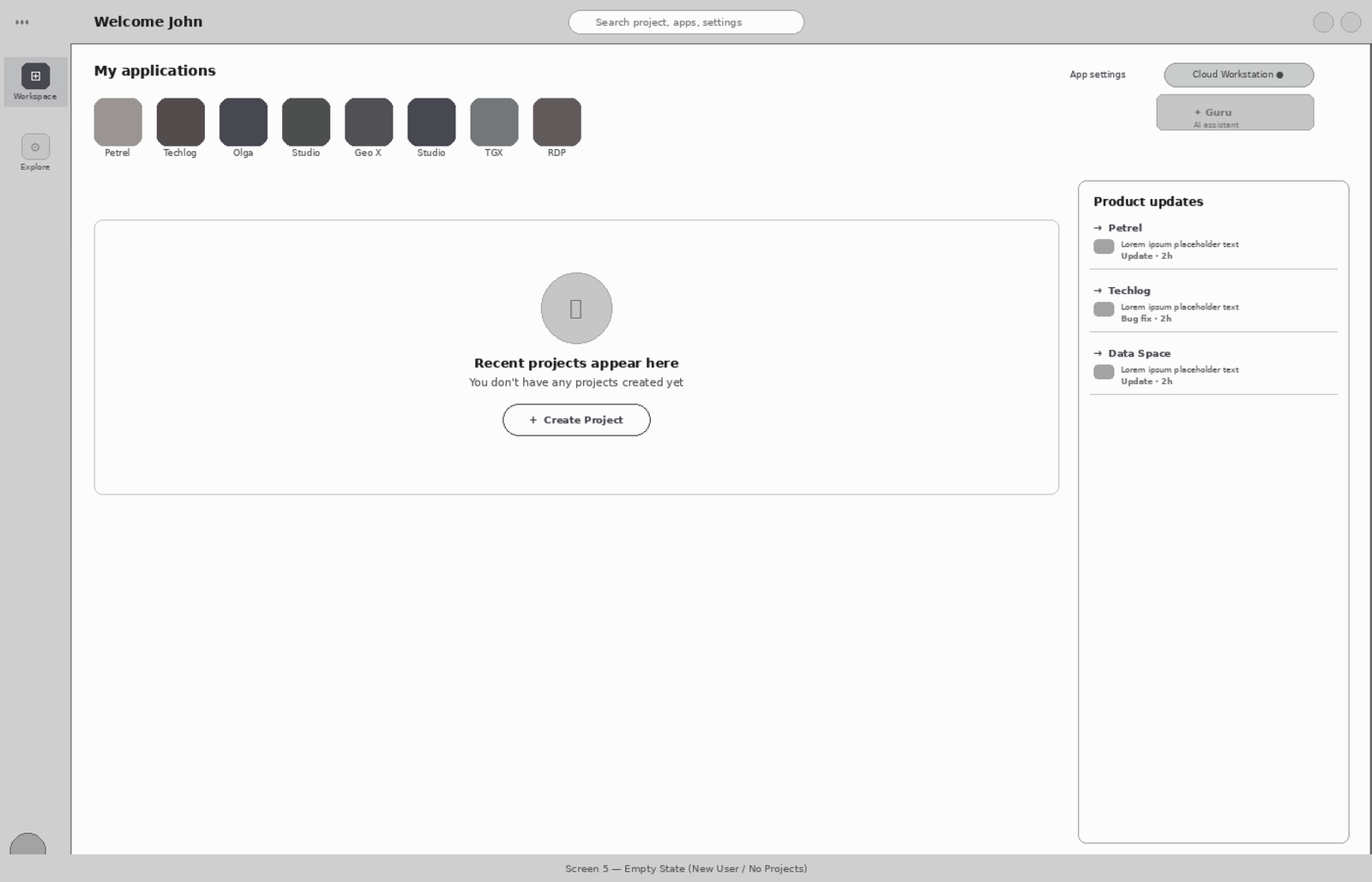
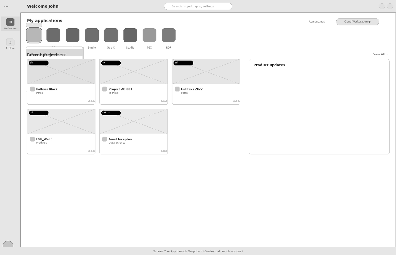
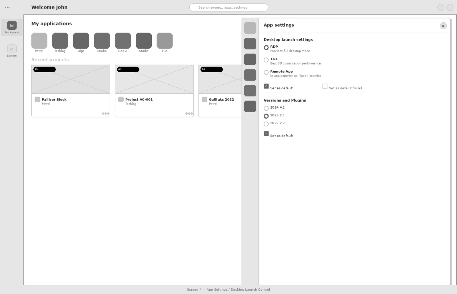
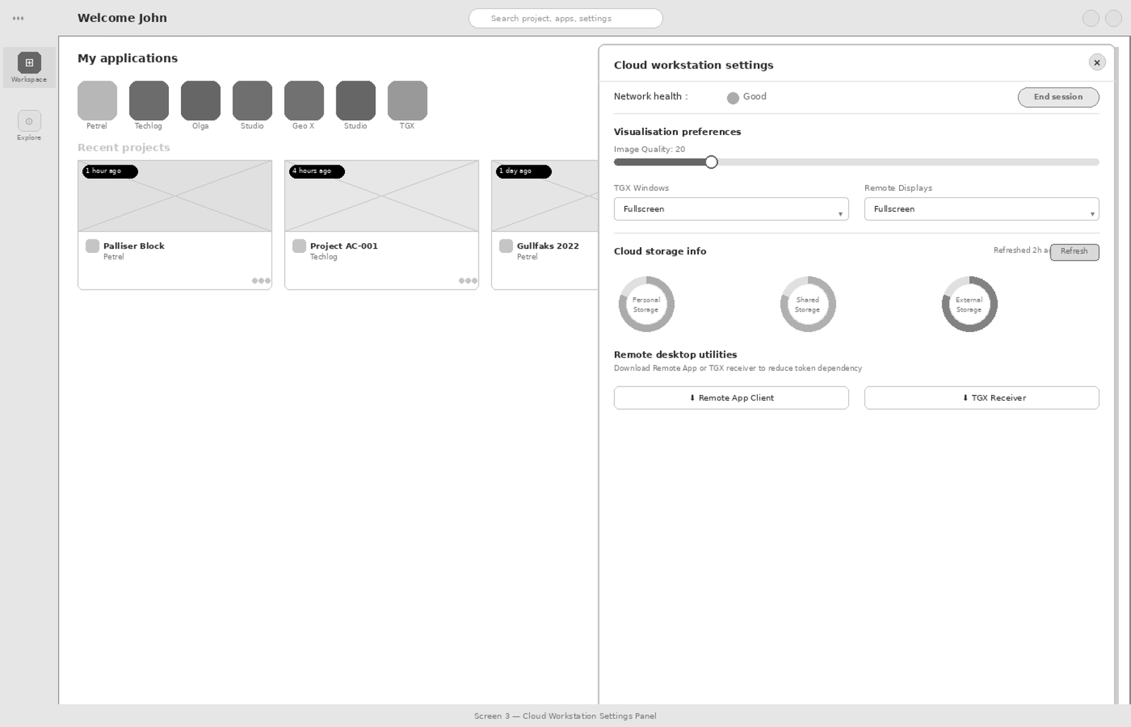
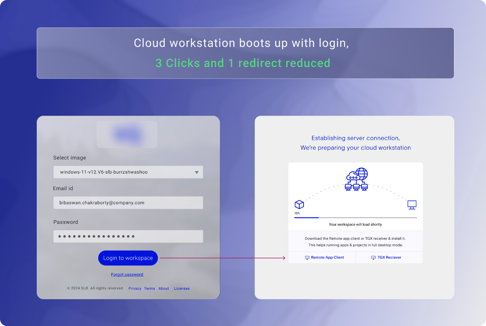
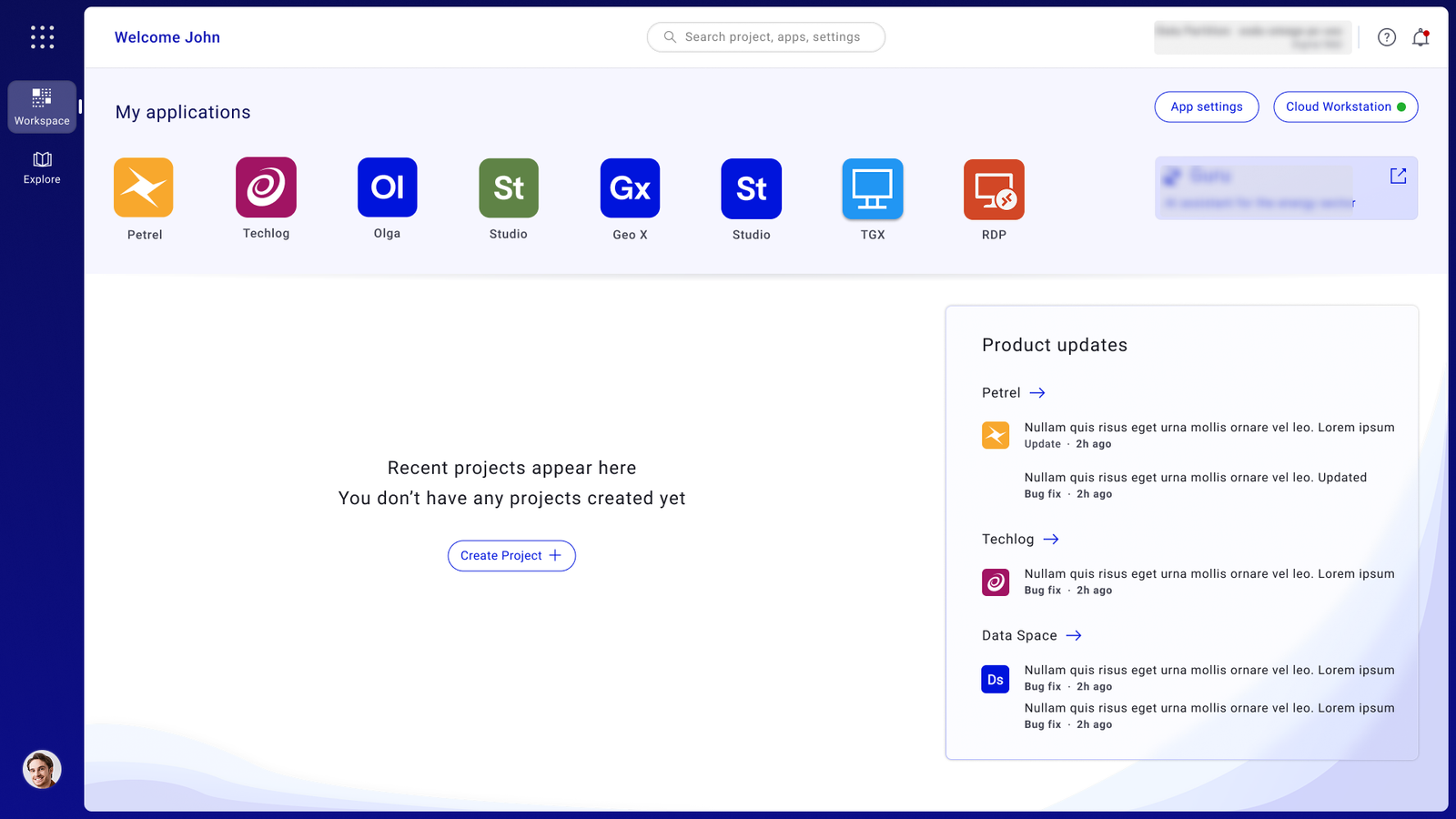
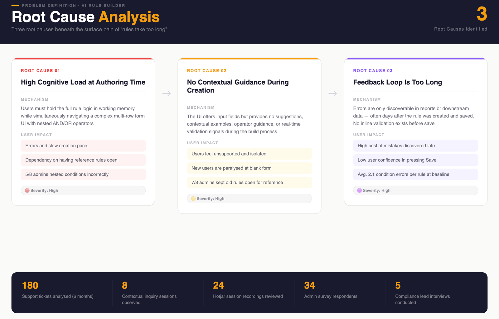
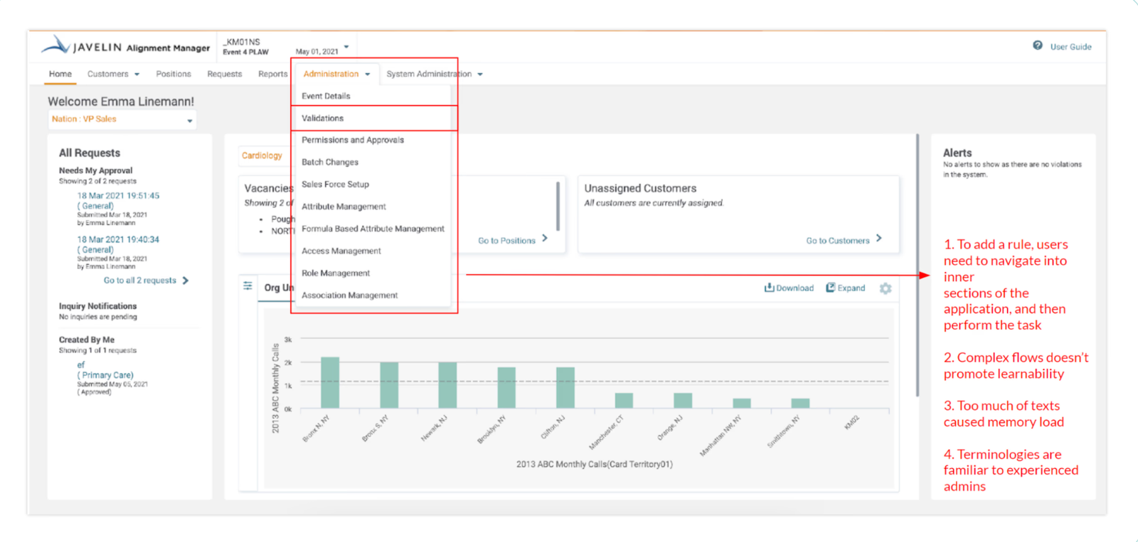
Redesigned a missioncritical geoscience workspace to unblock cloud migration, confronting 21click complexity, navigating 24 months of stakeholder alignment, and rebuilding around how geologists actually work.
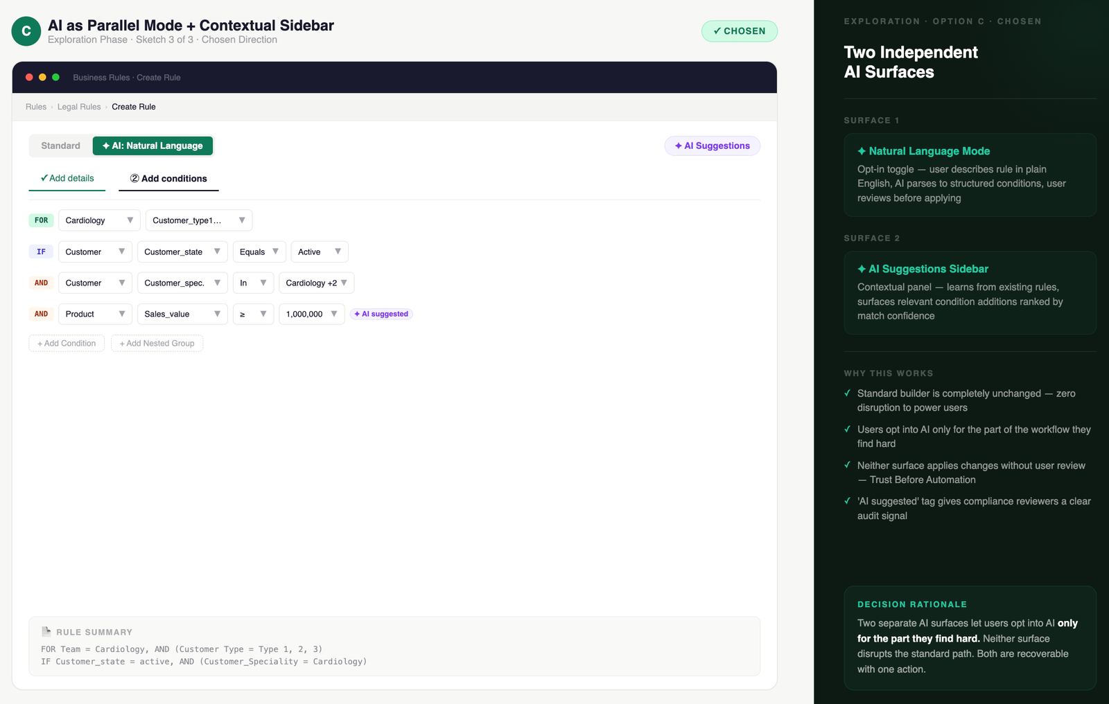
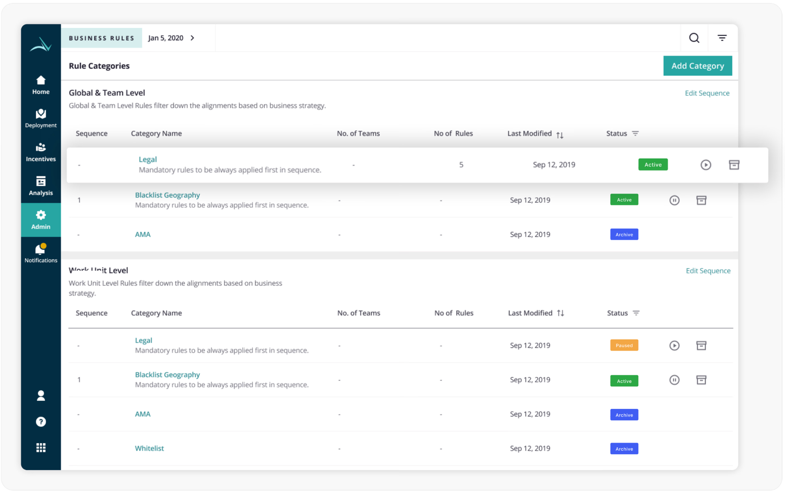
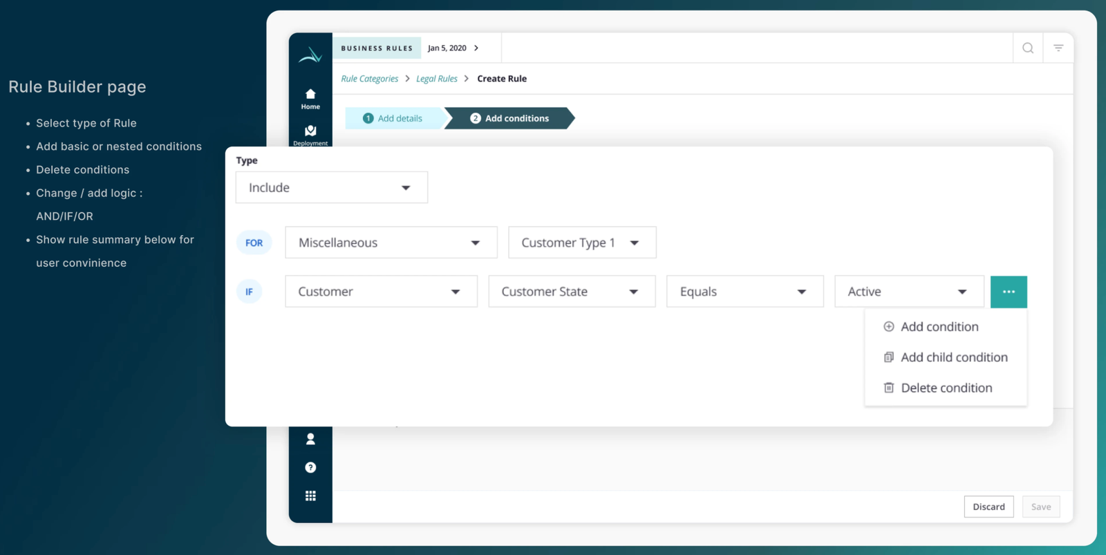
Simplifying complex
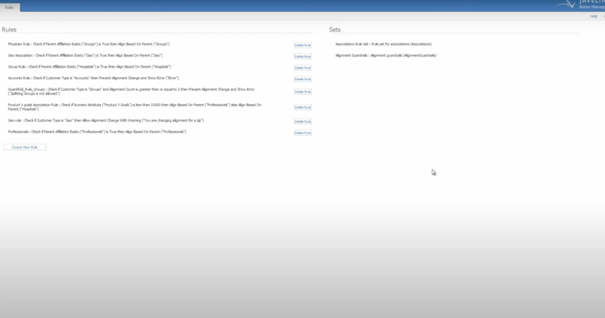
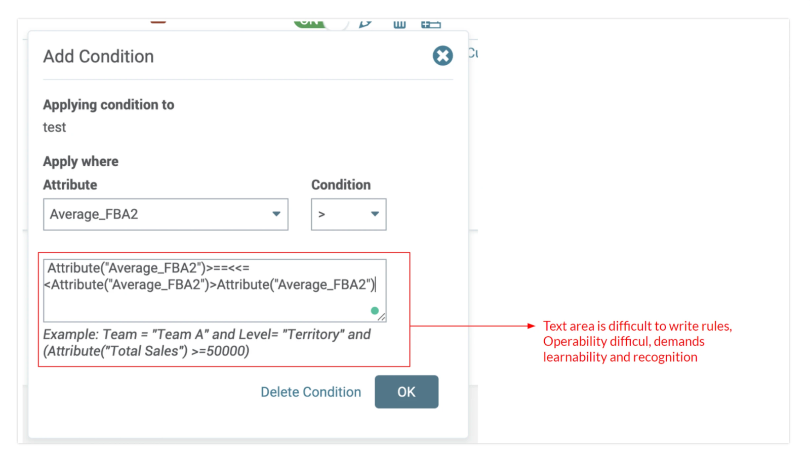
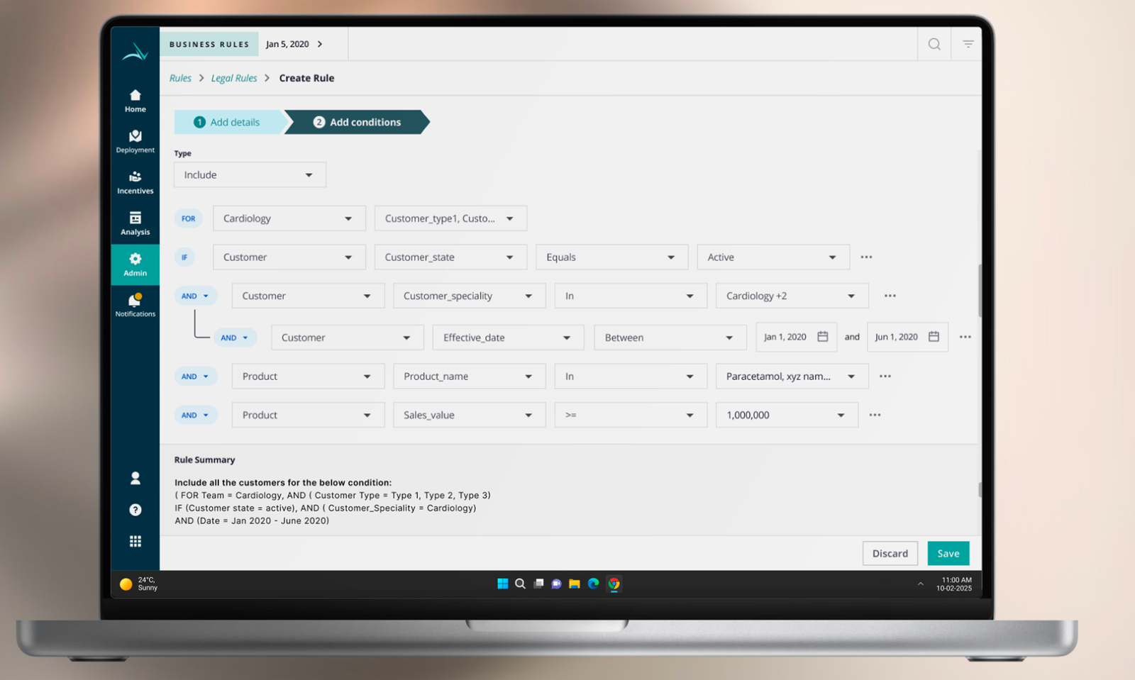
Business Rule builder
with AI assistant
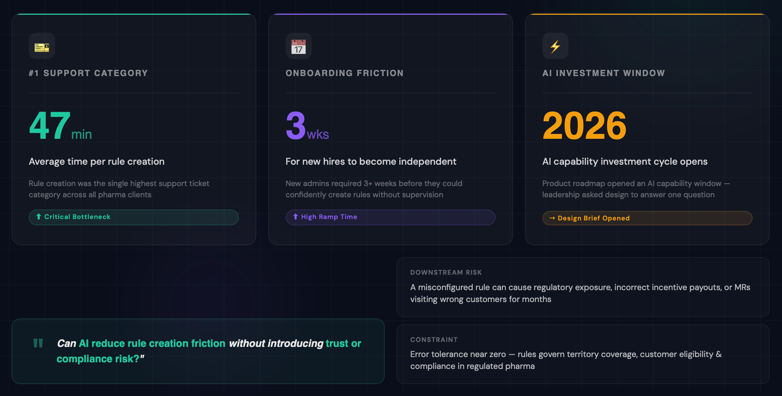
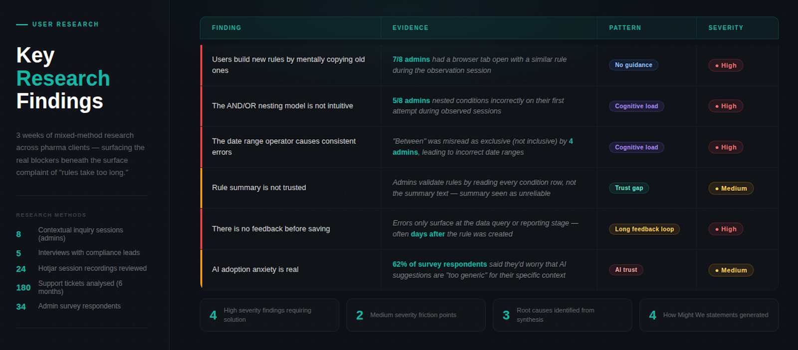
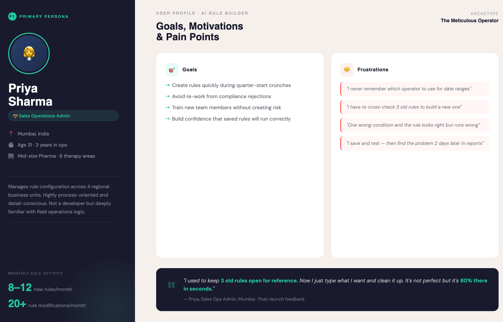
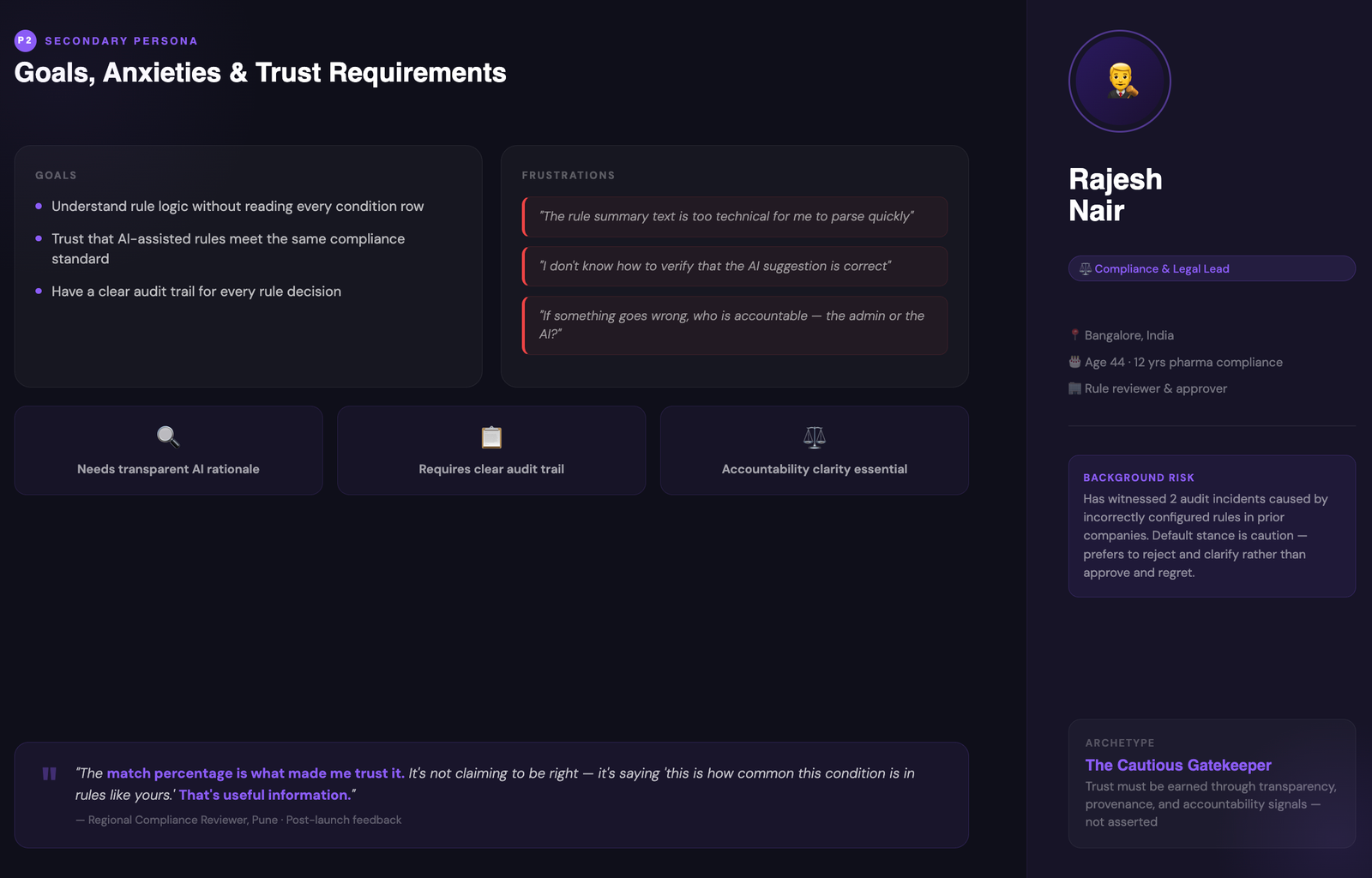
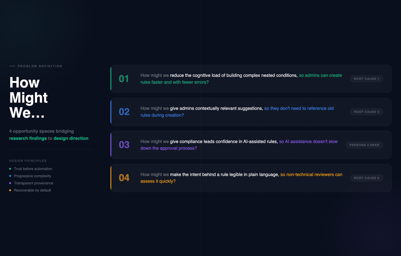
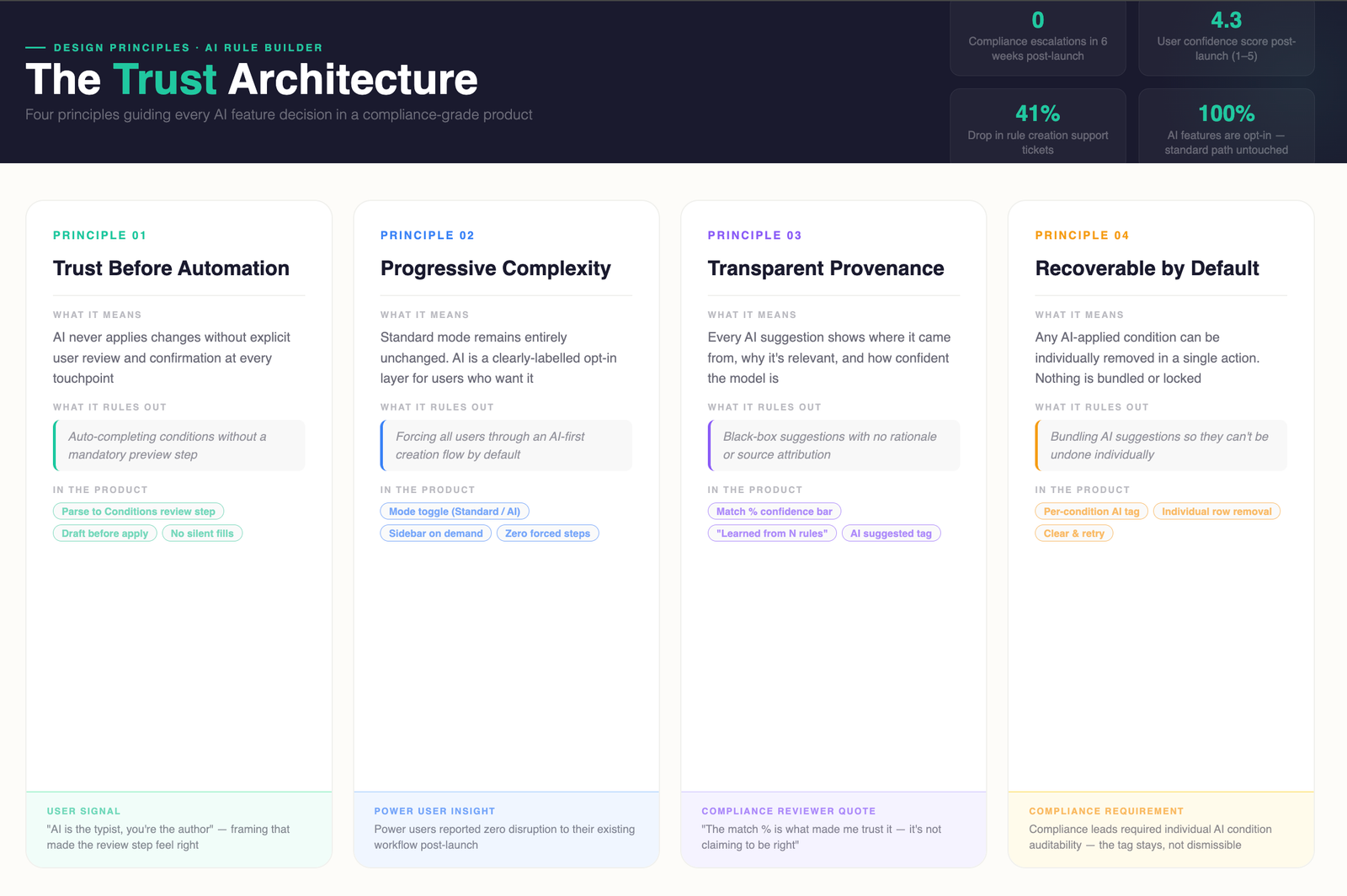
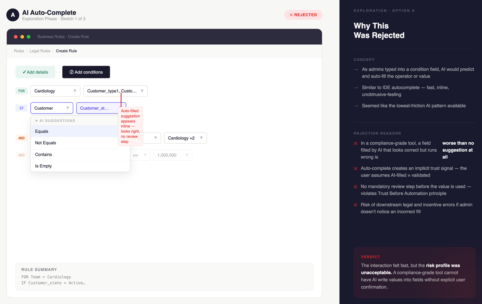
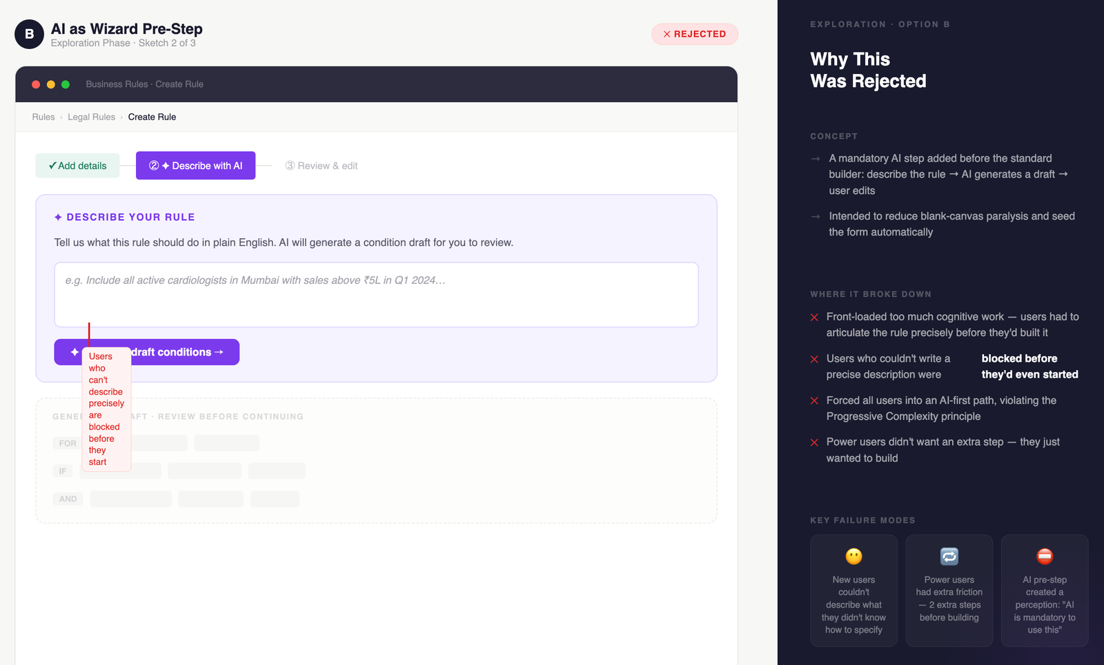
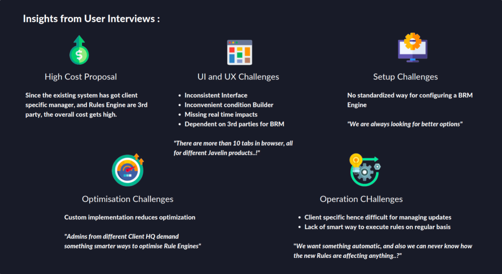
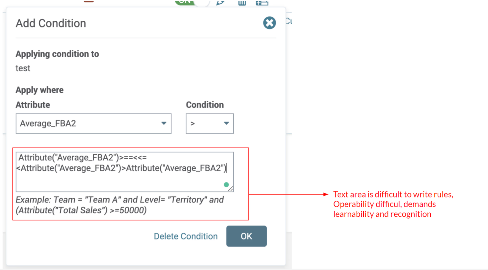
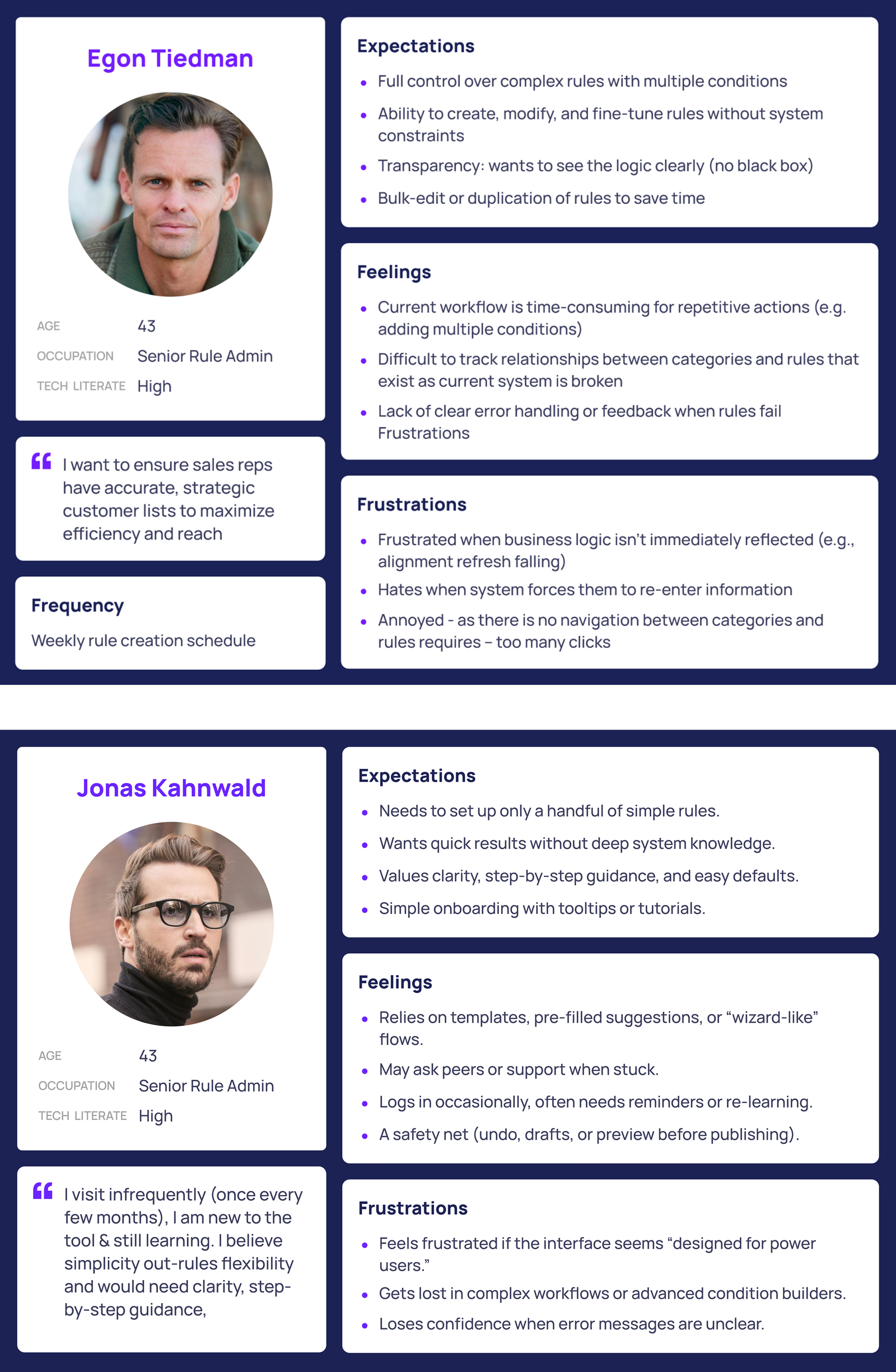
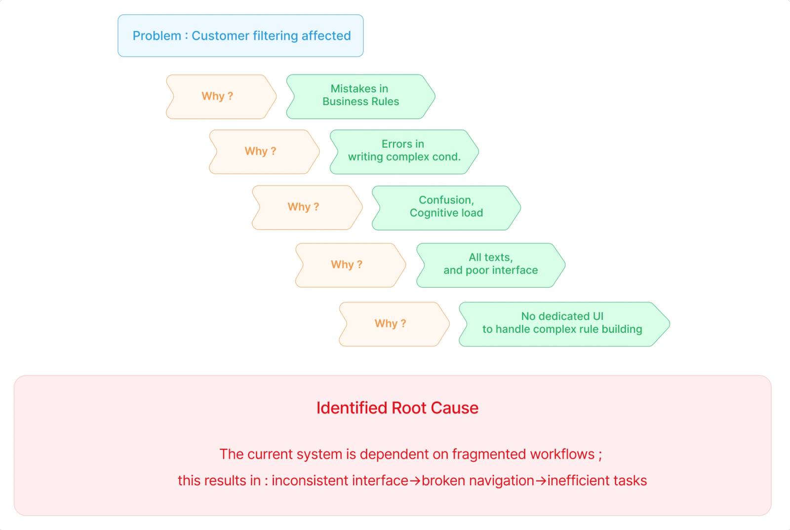
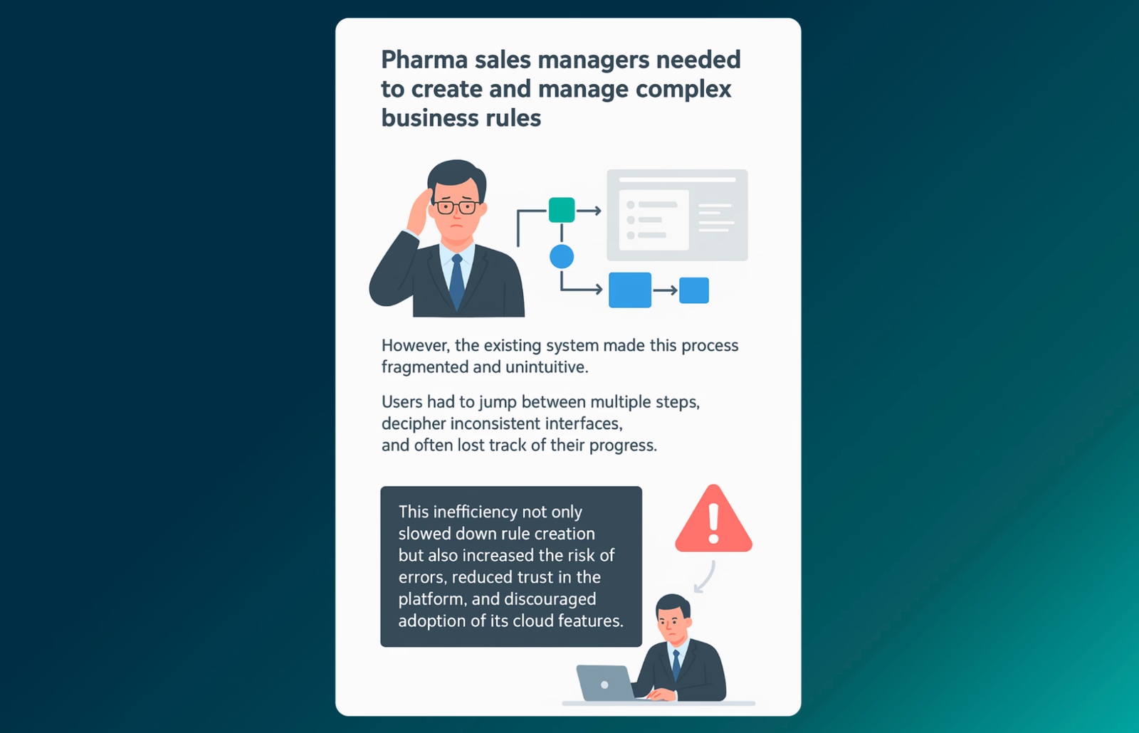
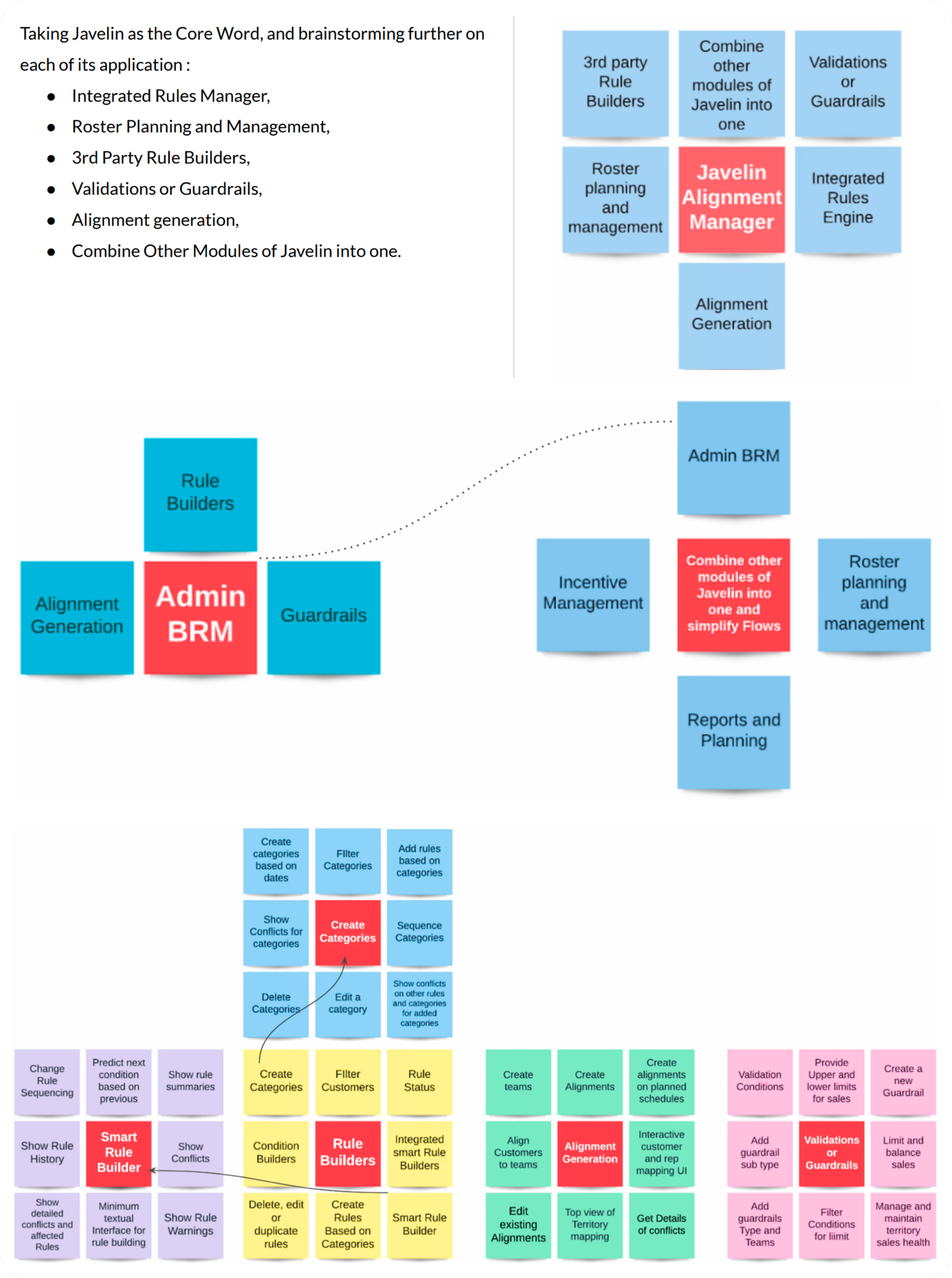
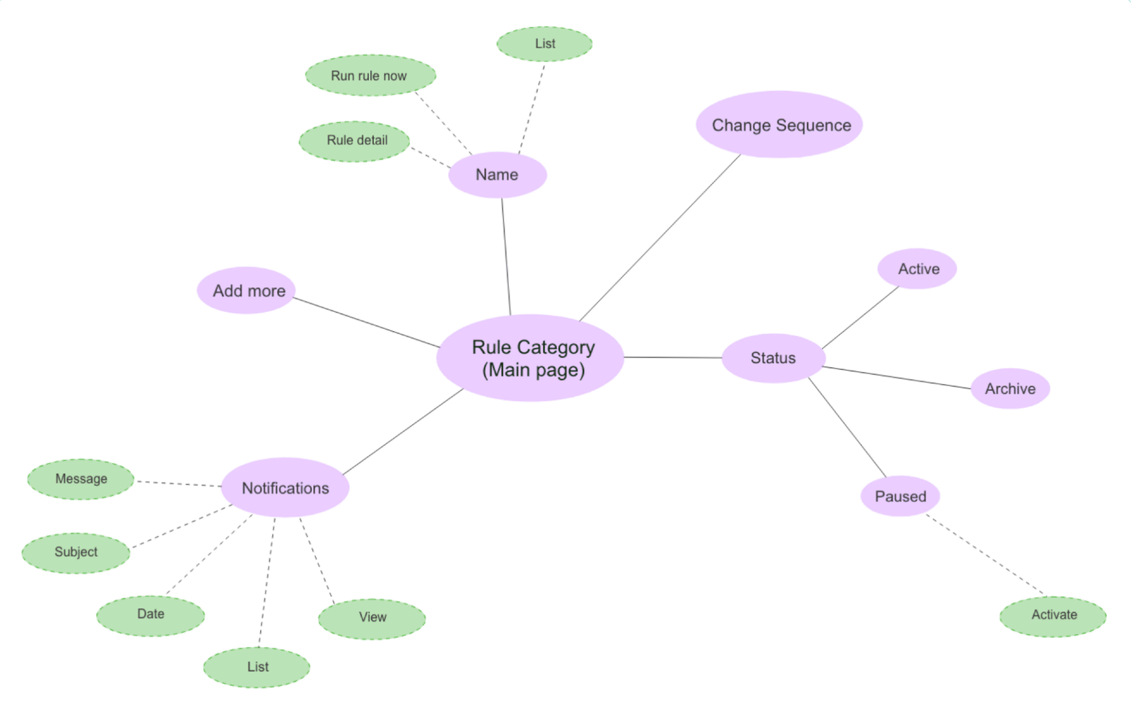
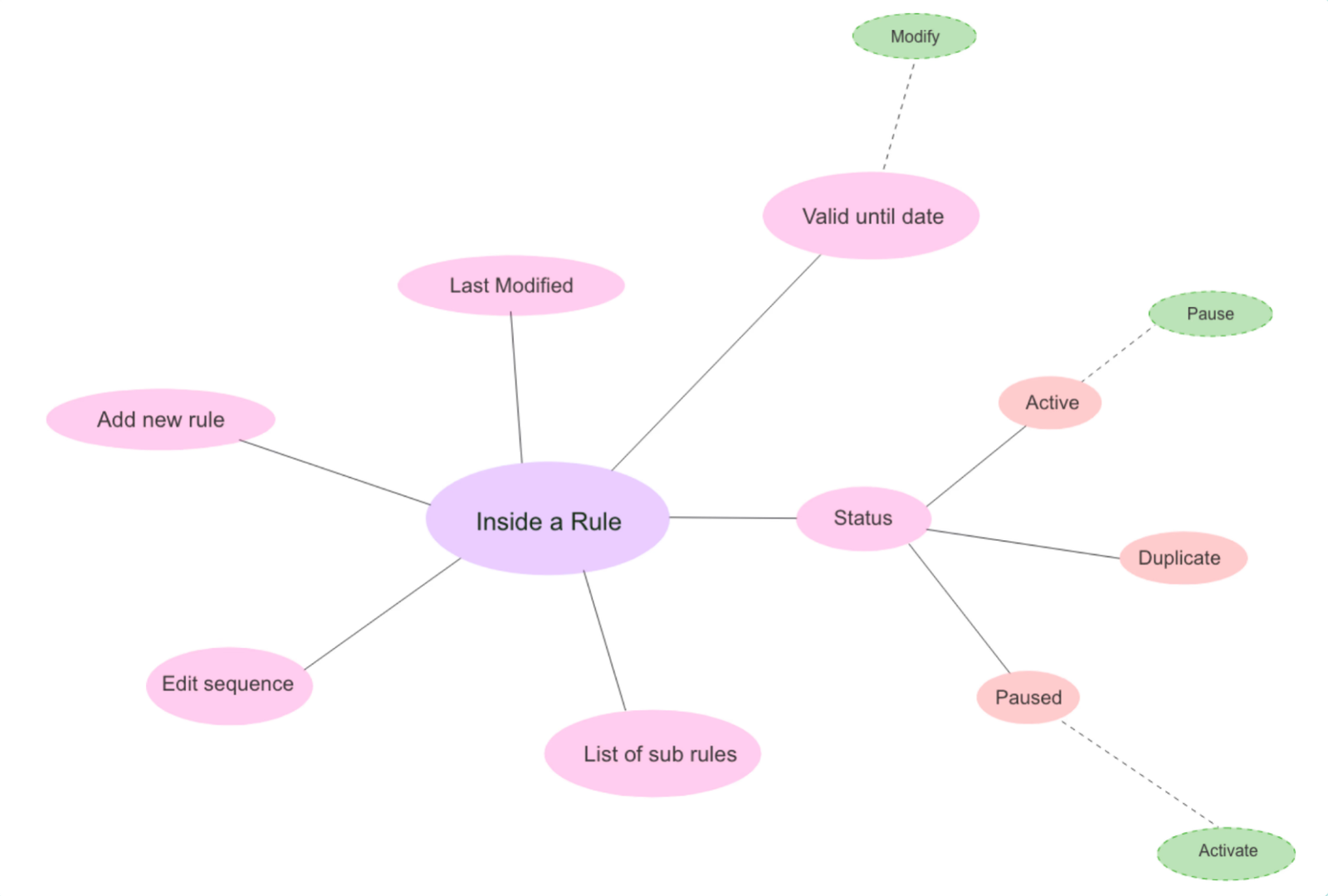
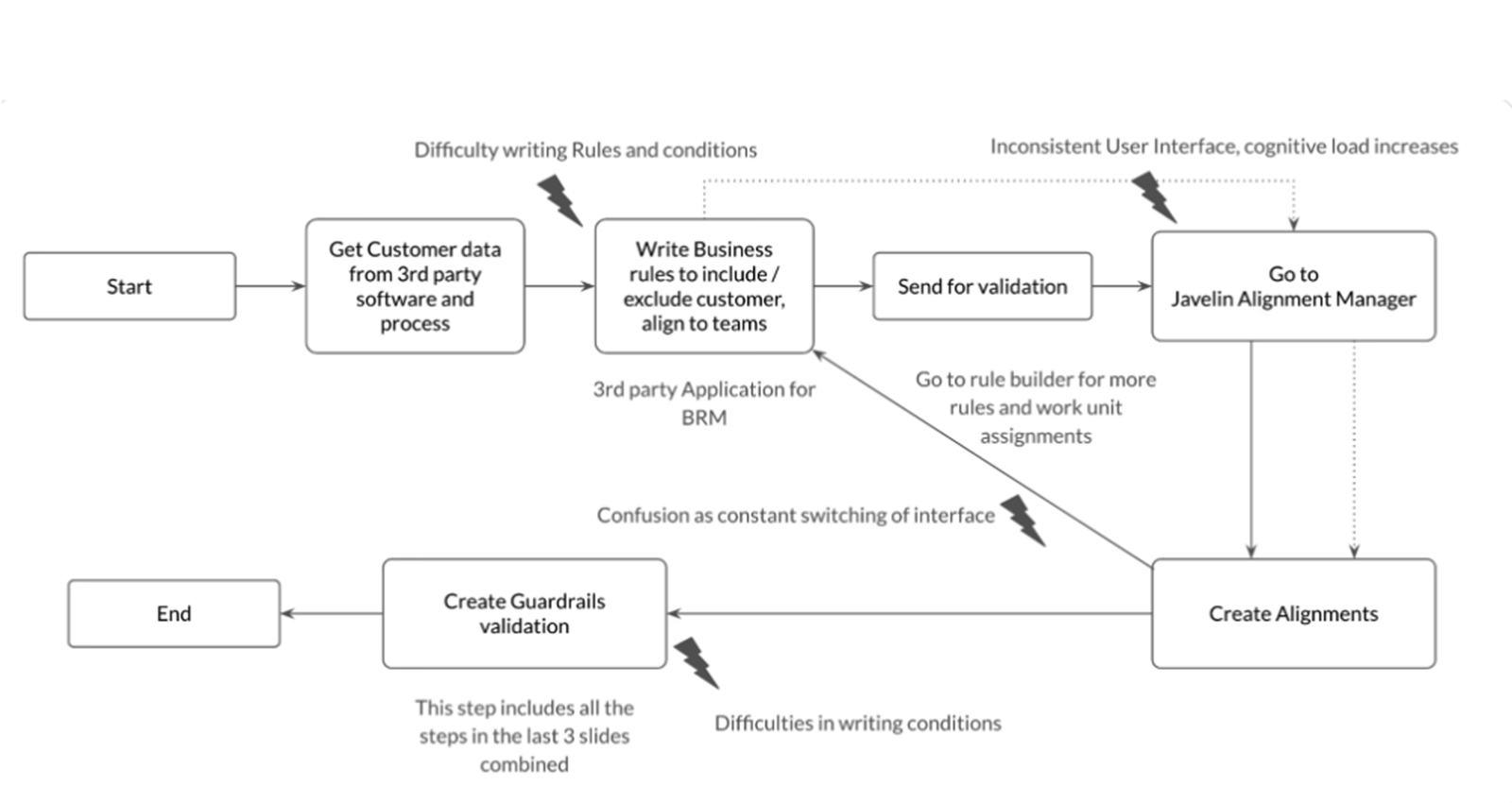
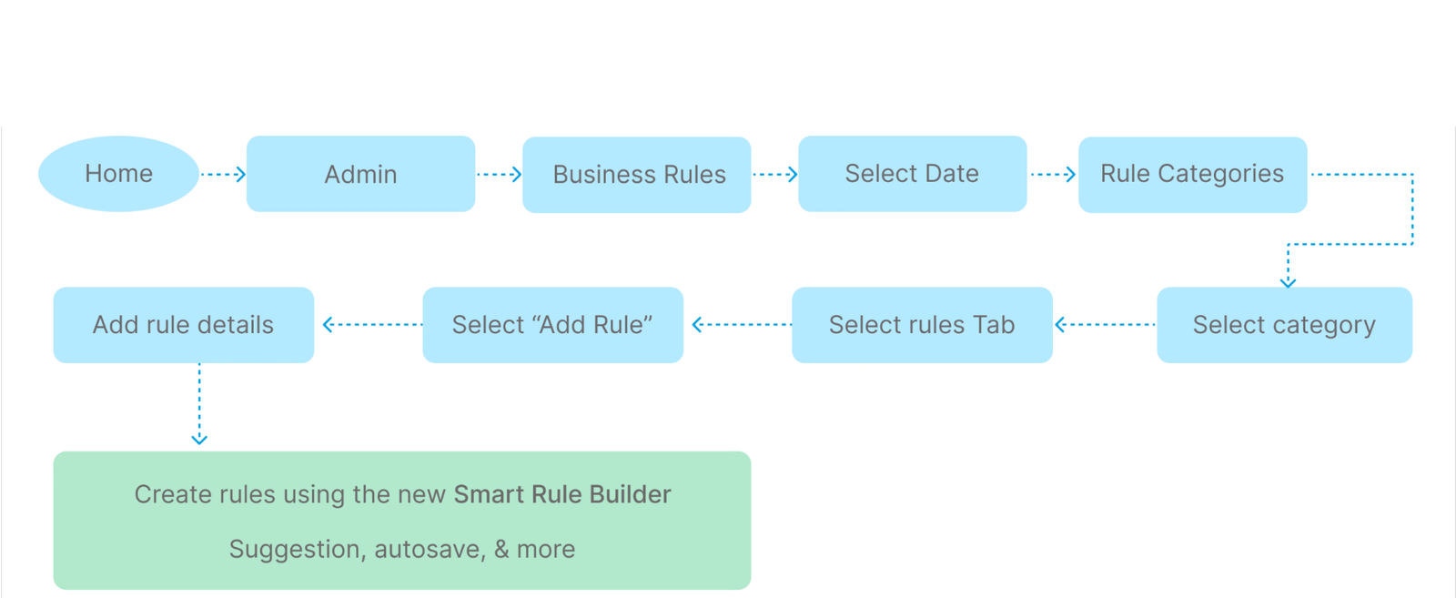
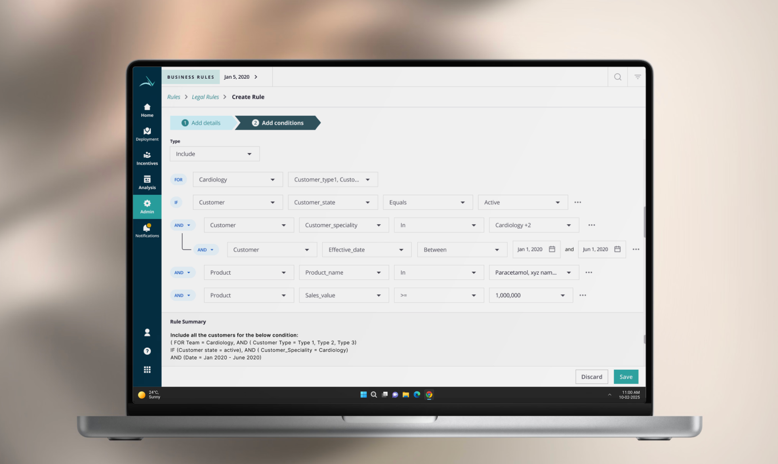
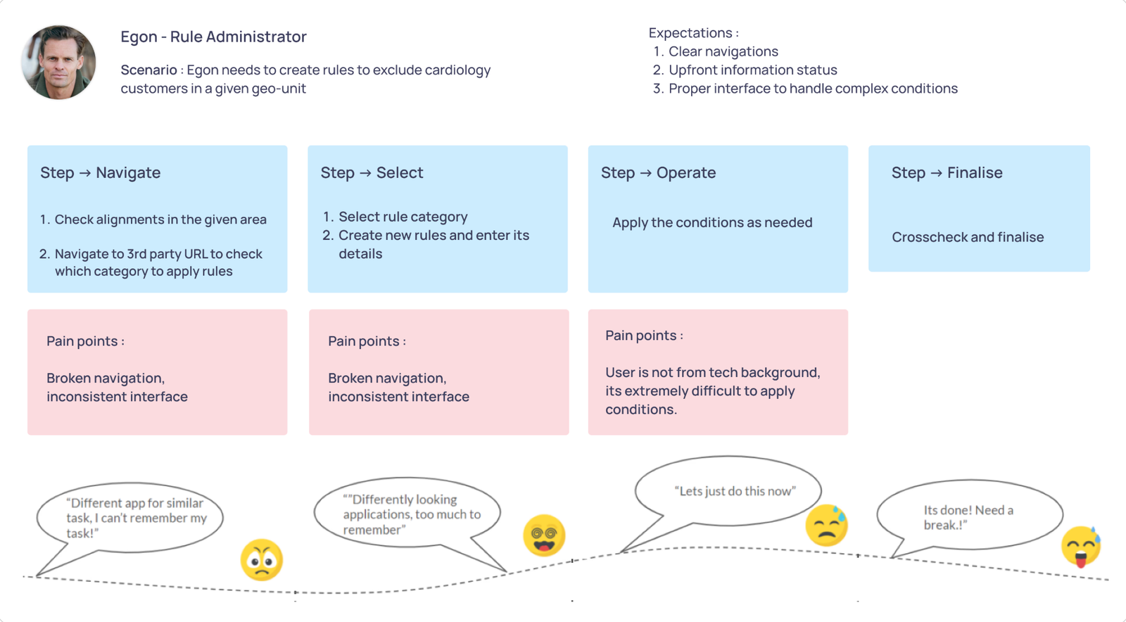
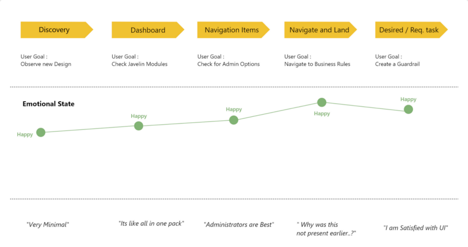
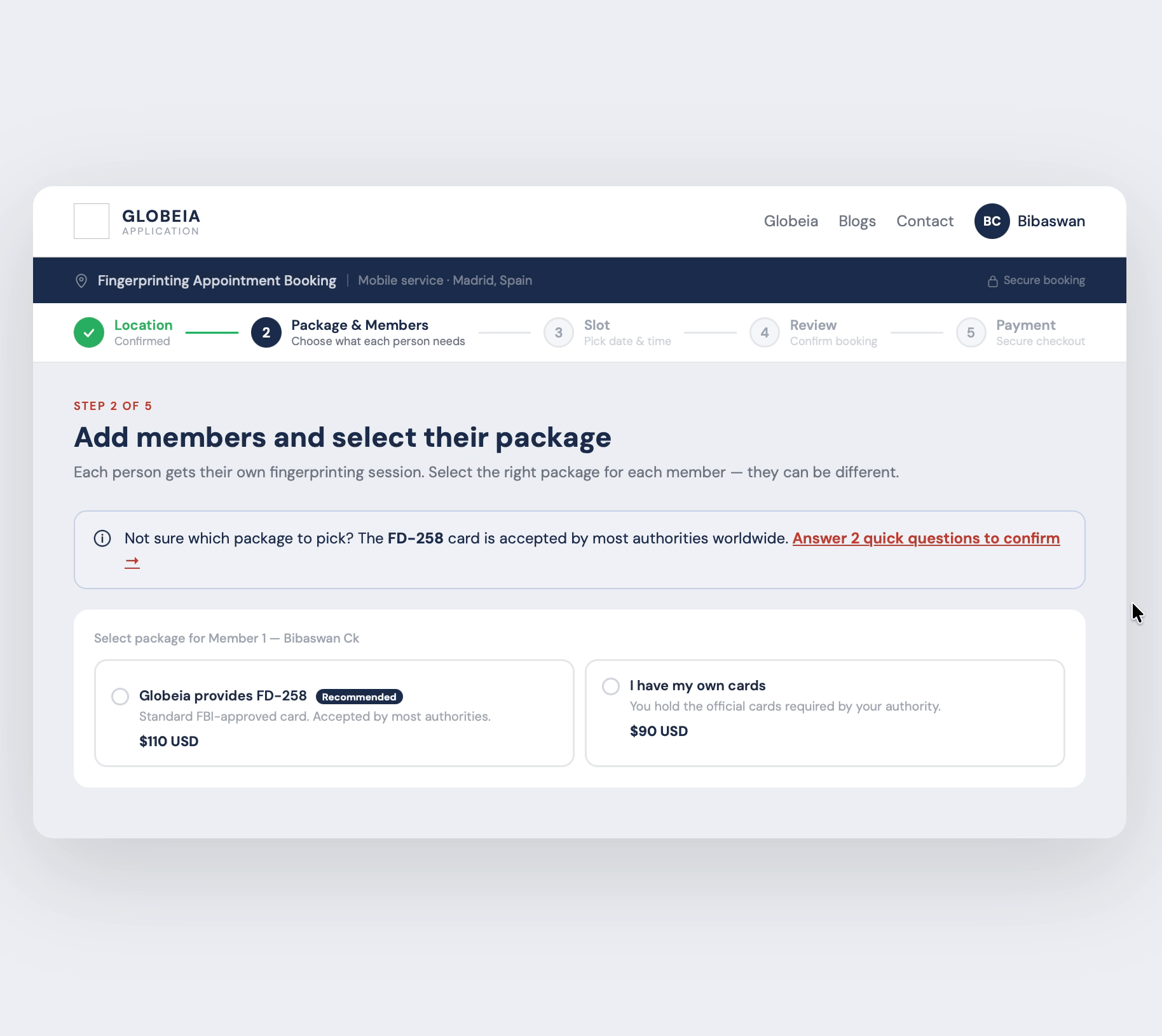
Redesigned a multirole admin system for pharma SFA, serving expert managers and occasional users with opposite needs. AI integration cut rule creation time by 76% without disrupting power users.

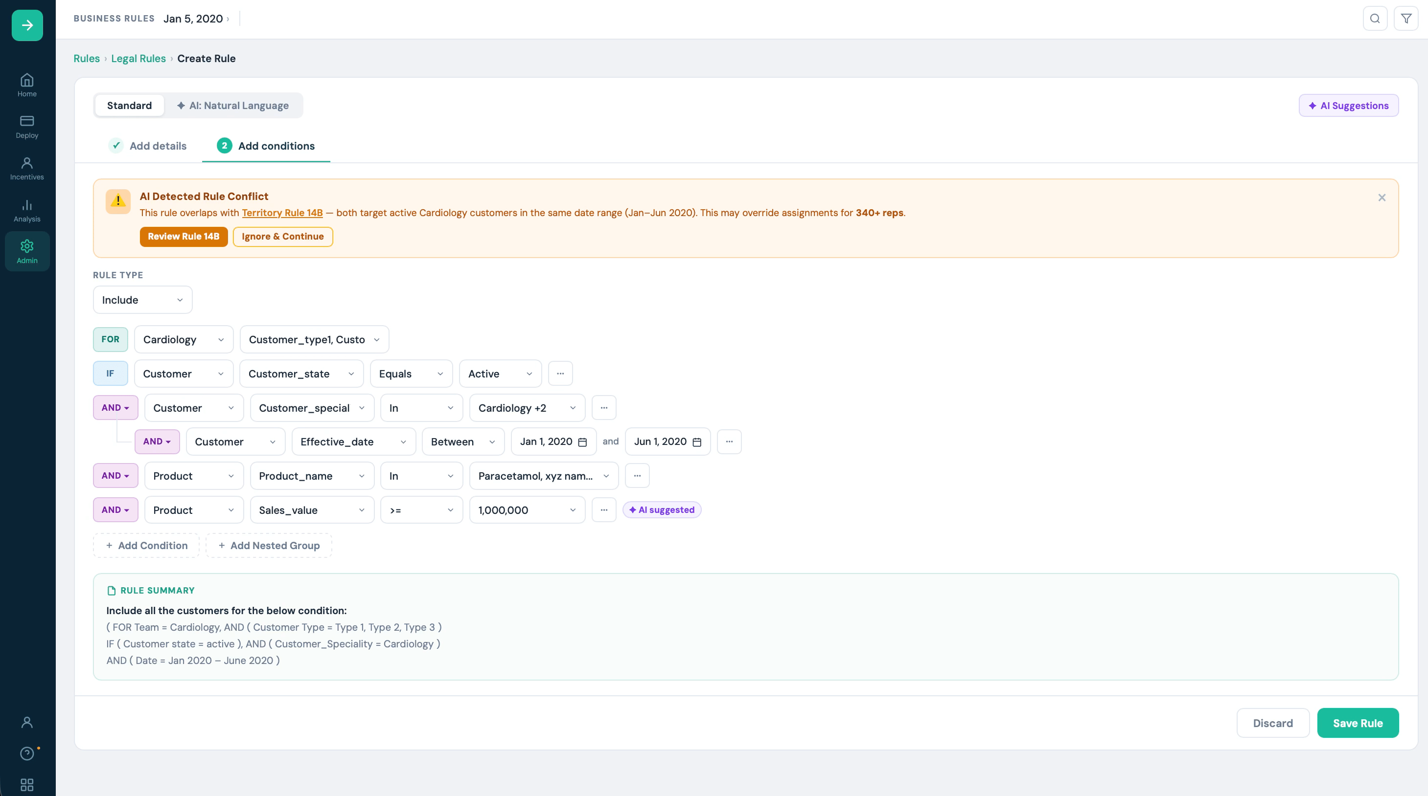
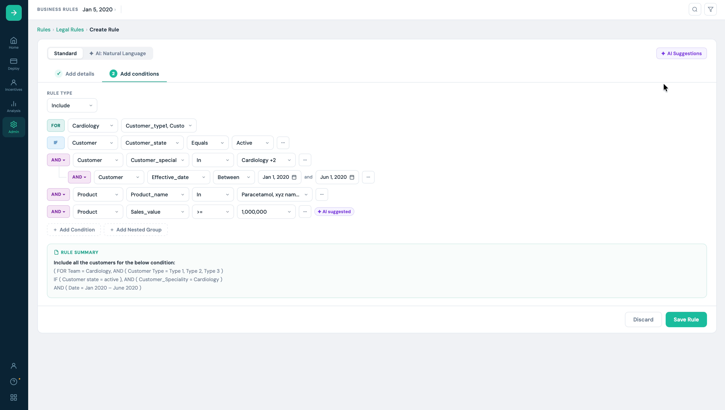
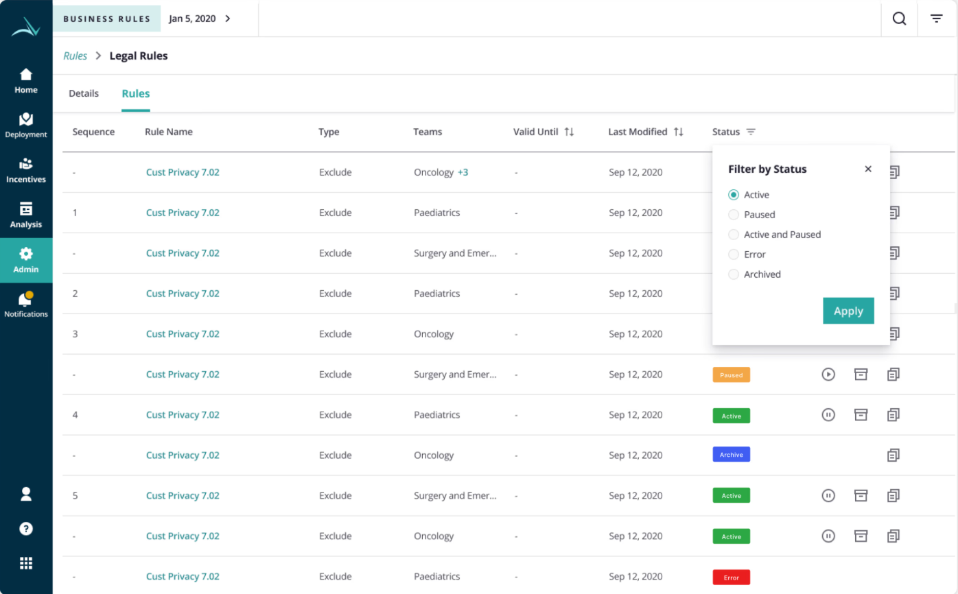
Designing a Pharma
Rule builder
from scratch
The shipped foundation behind the AI exploration in Case Study 02 , a complete rebuild of a broken multi-role rule engine for pharma SFA. Reduced rule creation time by 40%, lifted SUS from 33 to 82, and saved managers 5–7 hours every week.
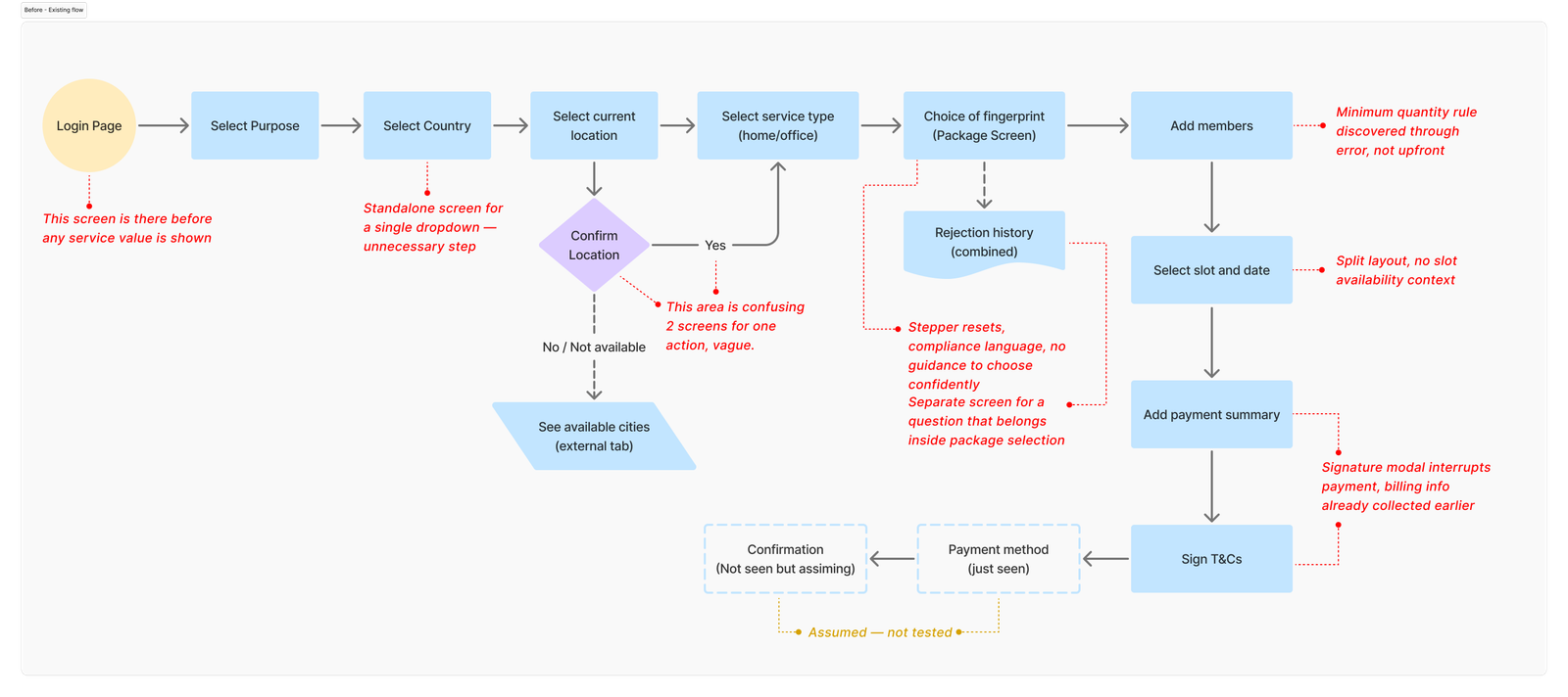
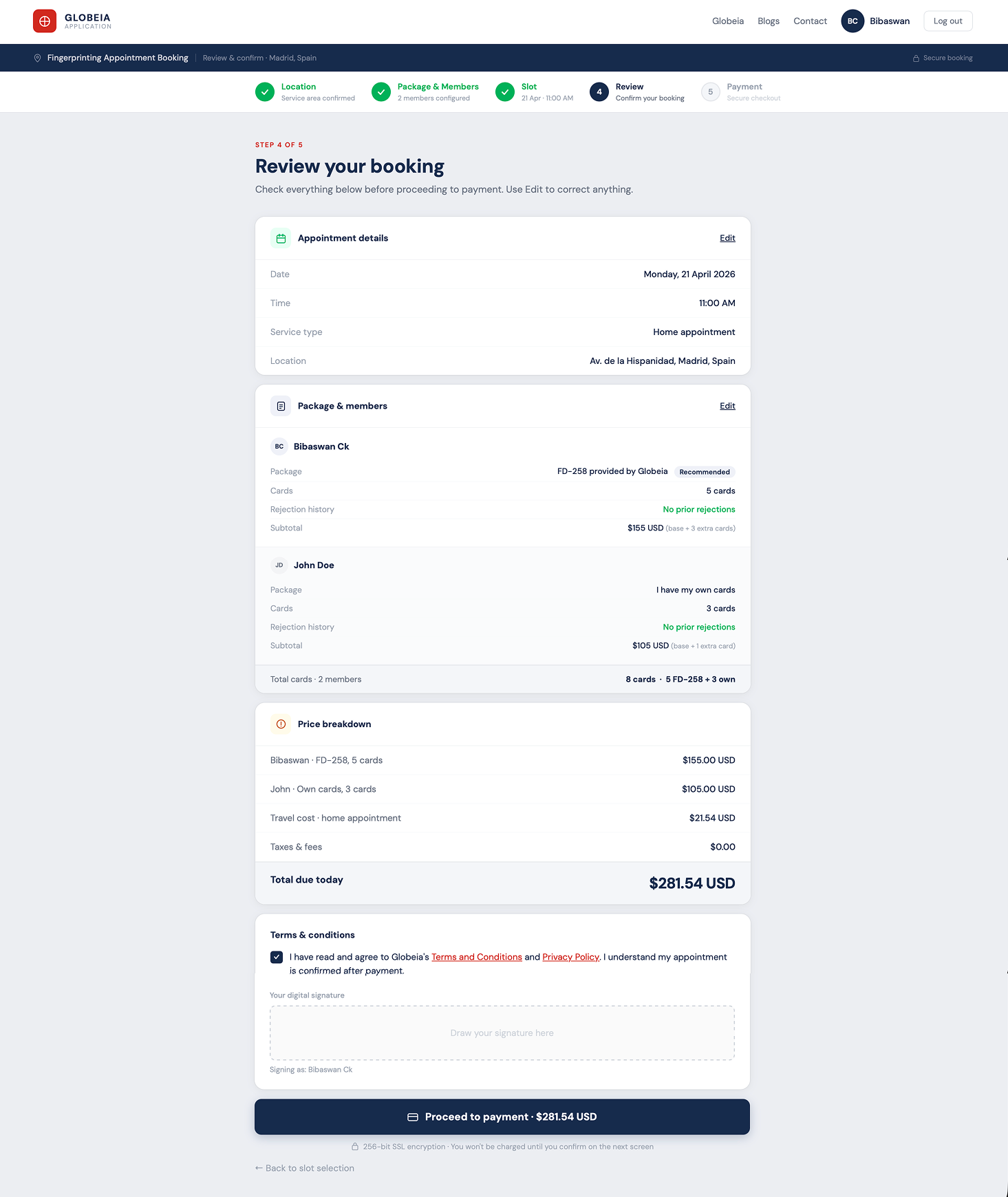
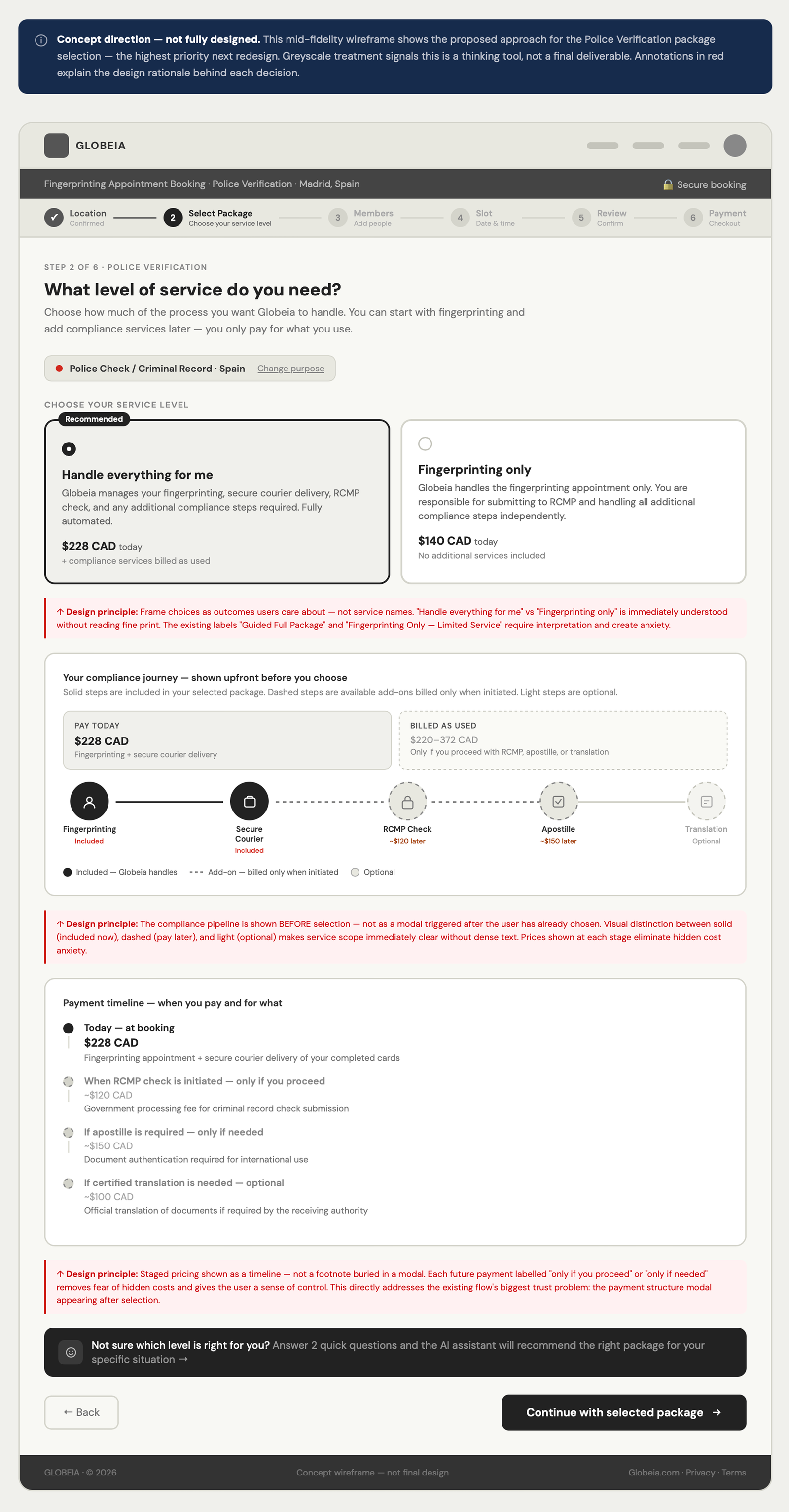
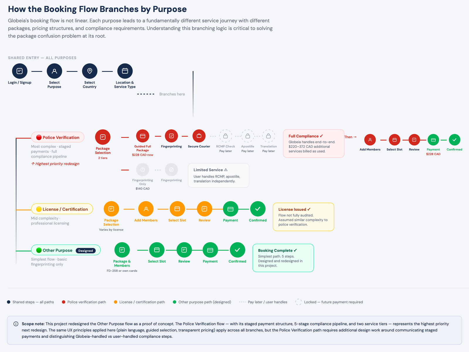
Fixing a broken
workflow
with AI assistance
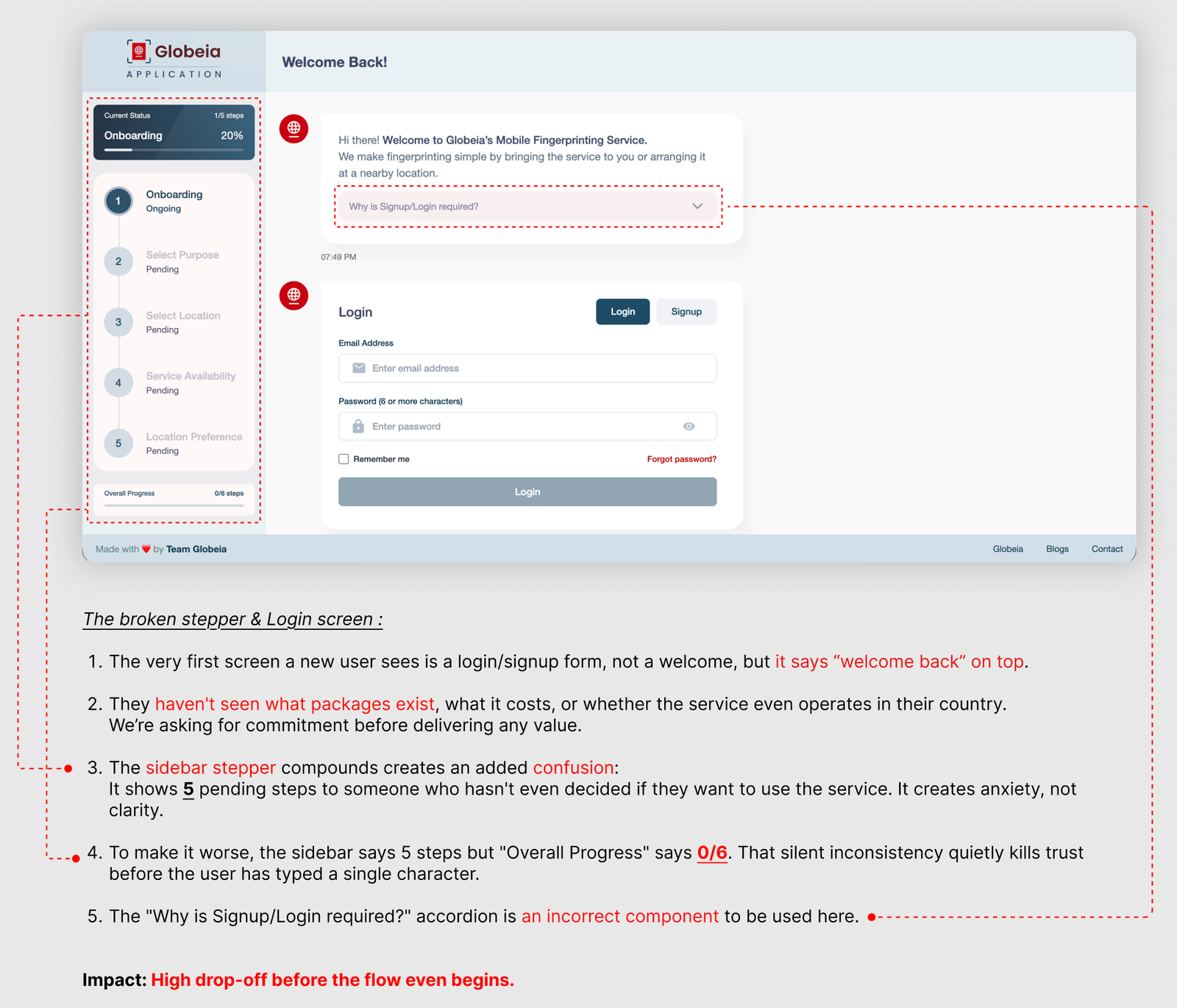
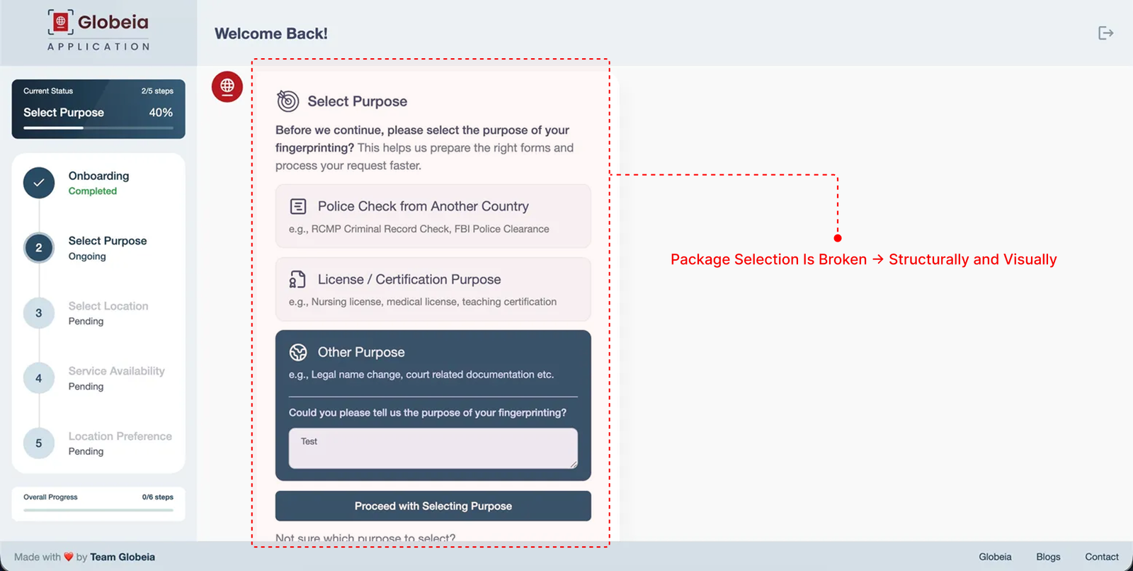
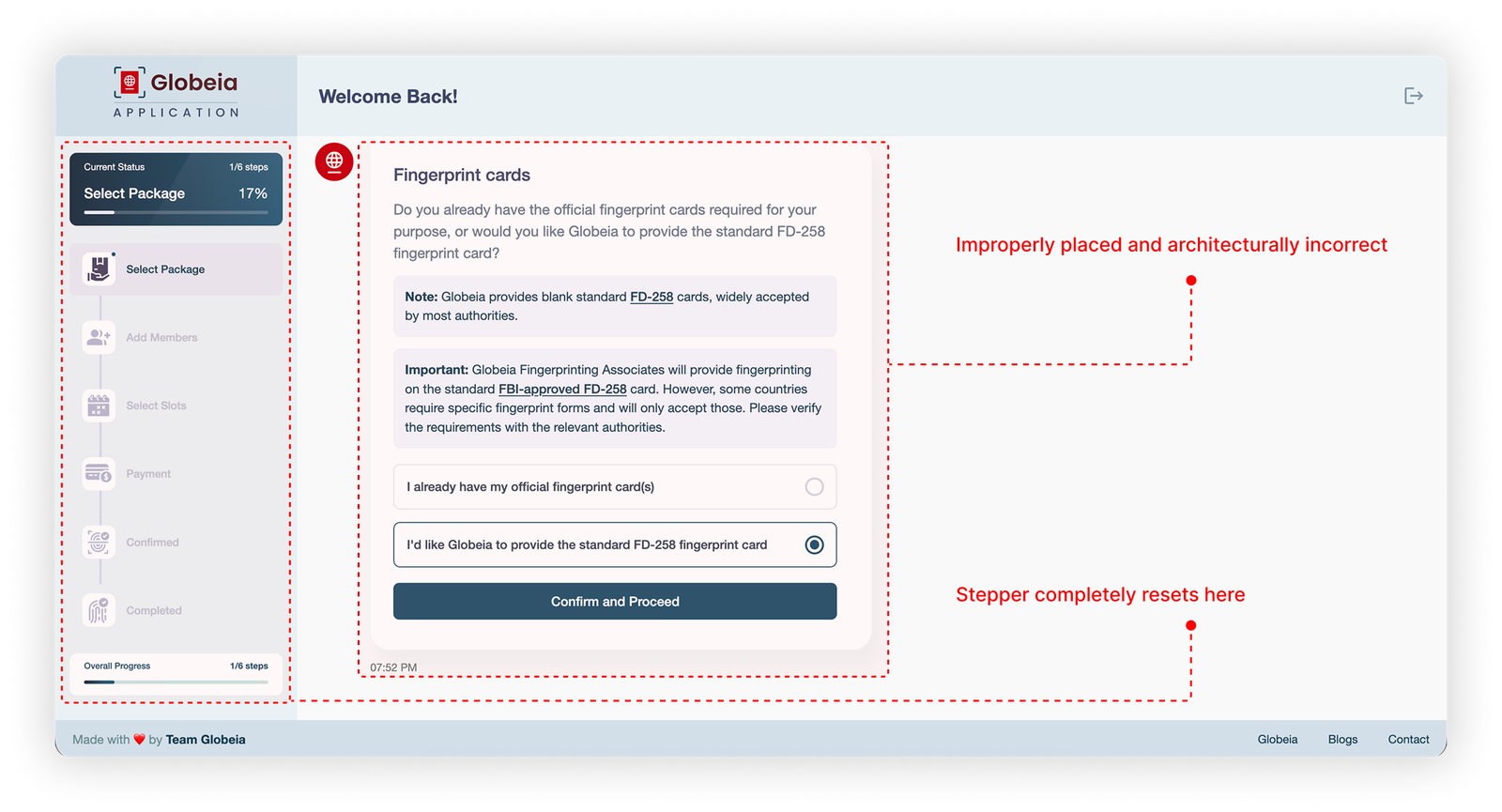
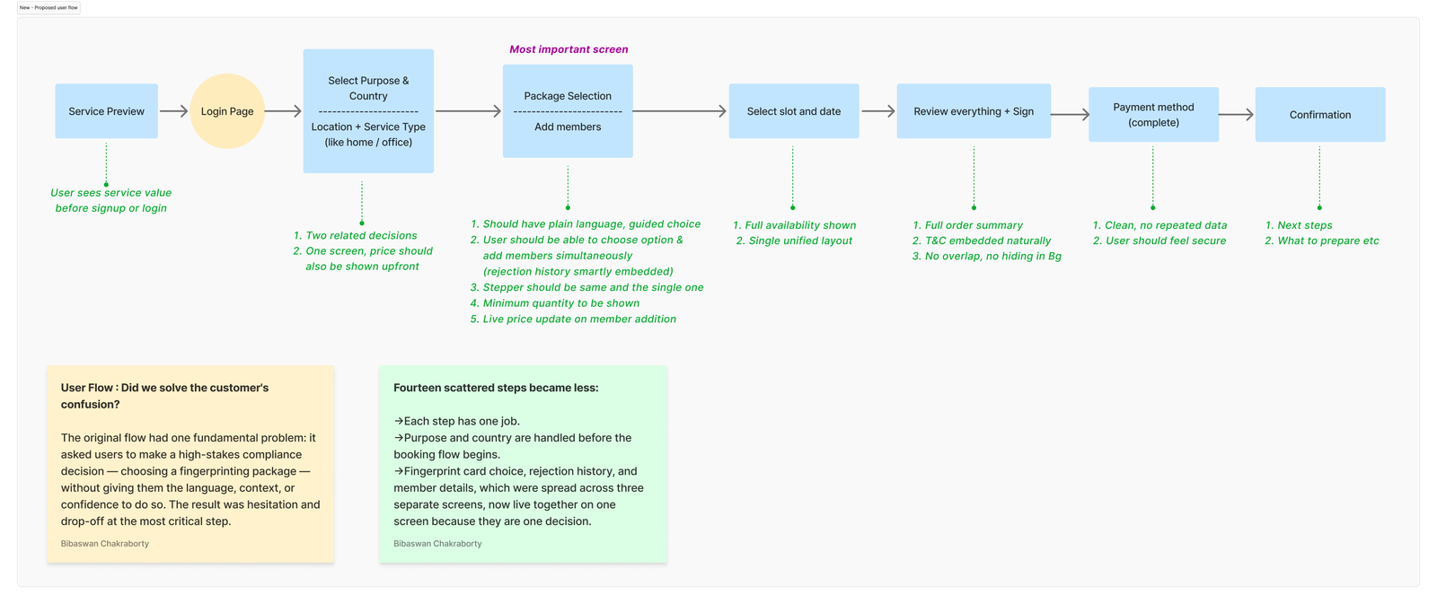
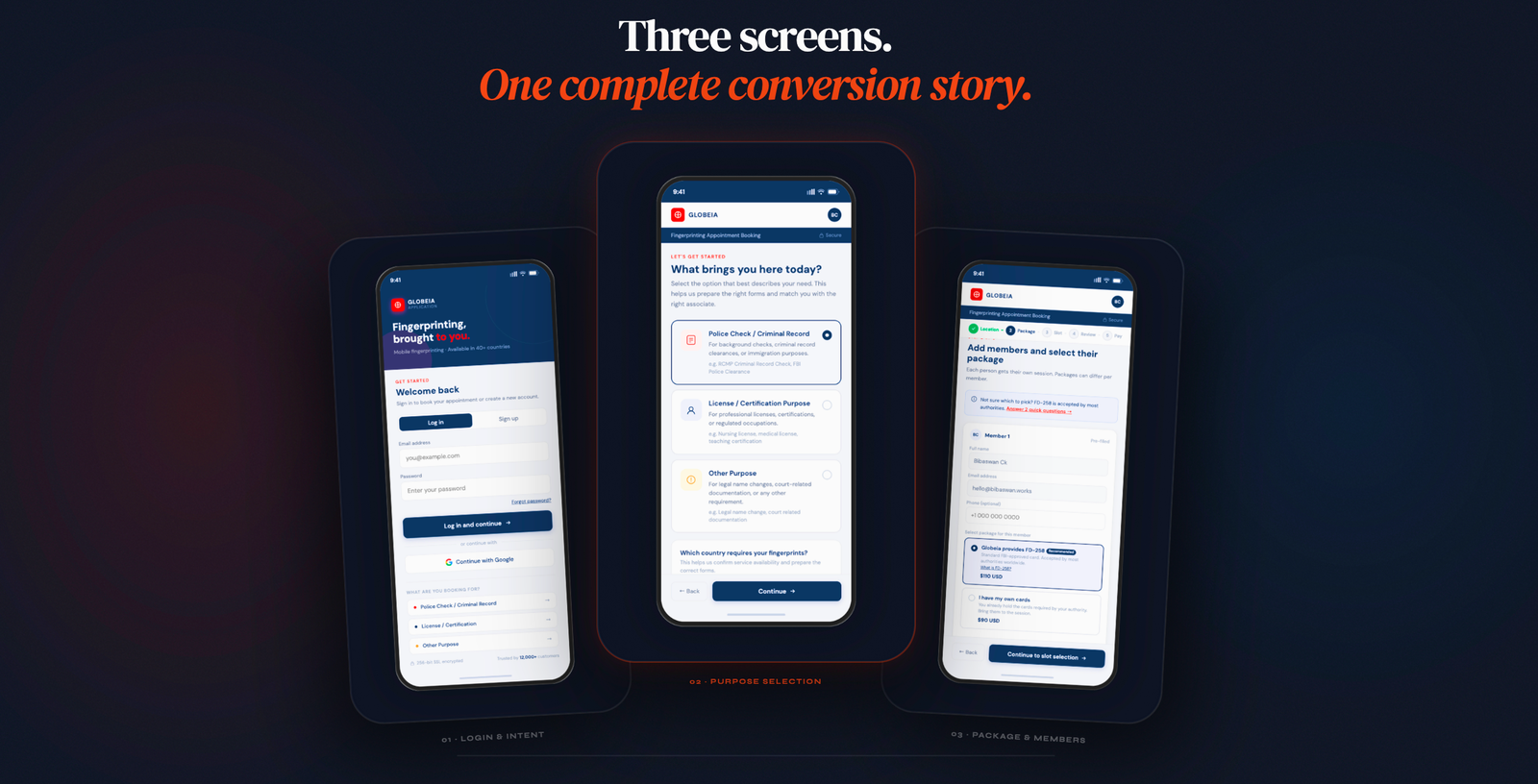
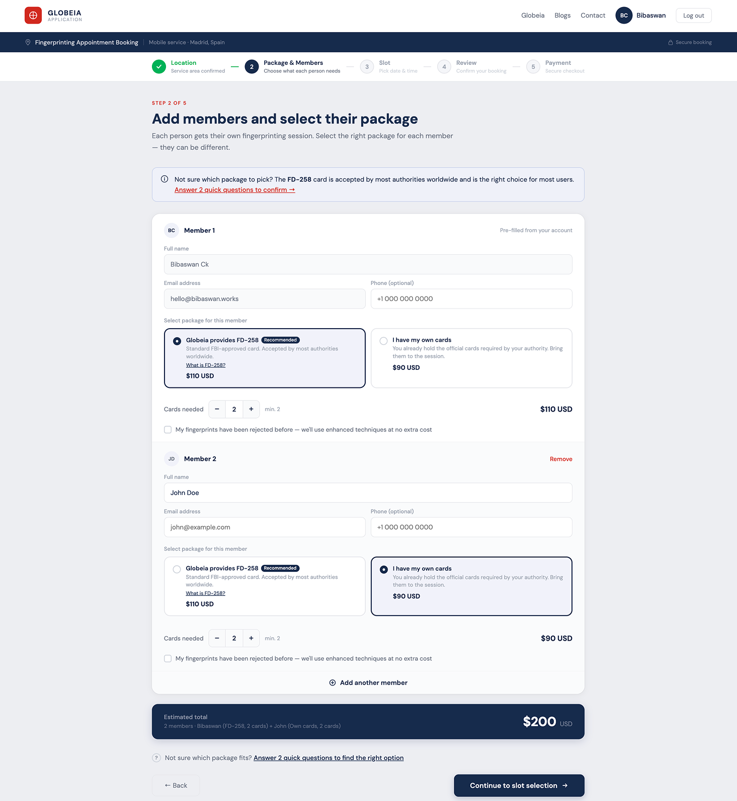
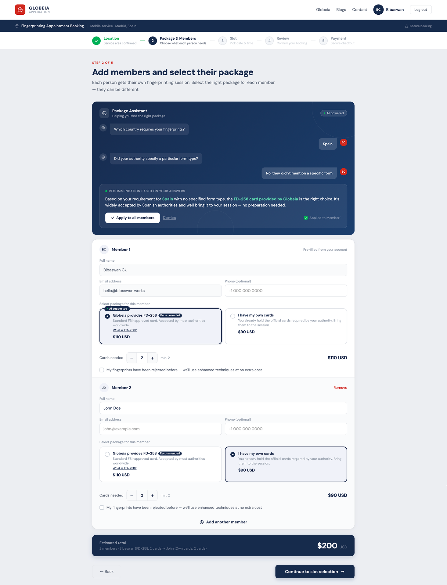
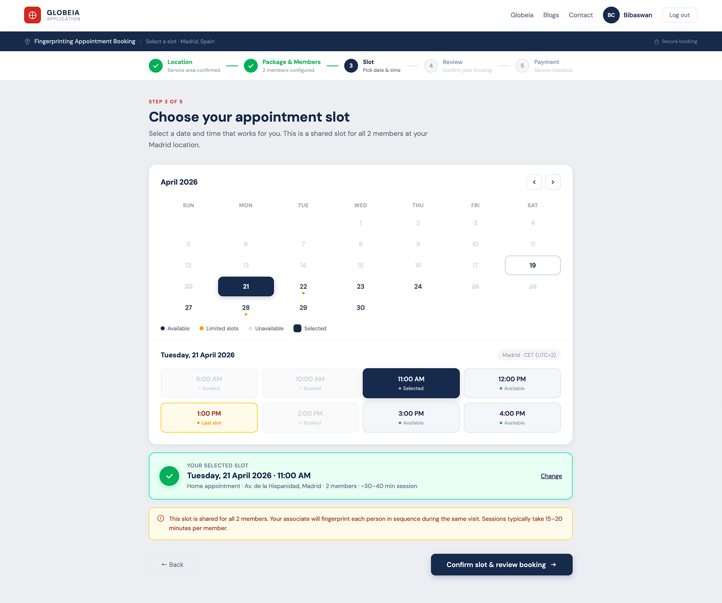
Identified 3 critical friction points, redesigned 5 key screens, and proposed an AI Package Assistant that eliminates the highestanxiety decision in the flow. Demonstrates full UX methodology: audit → IA → flow redesign → hifi.
Clinical Reporting Tool:
100% Team Adoption in 2 Weeks
Endtoend redesign of a pathology reporting system, from zero engagement to full team adoption in 14 days through targeted workflow intervention, not a visual refresh.
Design System for Complex Domain Workflows
Scalable component library and design language for a multiproduct enterprise platform, built for domain experts across global teams, with governance that survived 3 product teams contributing simultaneously.
Outcomes over outputs.
Always.
Enterprise work fails when designers don't understand what users actually do. I embed in the domain before touching a screen, learning the data models, the role hierarchy, and the workflows that already exist.
Enterprise products serve multiple user types simultaneously , admins, operators, reviewers, and viewers with conflicting needs. I map every role before designing any flow, because the admin experience shapes everything the end user sees.
I find where workflows break , not where they look broken. Click depth, cognitive load, task failure, and support ticket volume are the real diagnostics. Heuristic audits confirm; usage data reveals.
Every screen is a decision point. I design for the choice users need to make , not the feature the team wanted to ship. IA defines the structure. Interaction design reduces the friction at every step.
Design is a hypothesis. I test it, instrument it, and hold myself to the outcome , not the deliverable. Postlaunch adoption data, support ticket trends, and task success rates are the metrics that matter.
Engineering wants to ship. Sales wants features. PMs want velocity. I navigate these pressures by keeping research visible, tradeoffs explicit, and the cost of bad UX quantifiable. Data beats opinion in every stakeholder room.
What I bring to
complex products.
Five years of enterprise UX means building fluency in the systems that make B2B SaaS hard , not just the screens that face users.
What they say
He doesn't just design screens , he redesigns how the team thinks about the problem. The workspace project would have shipped as a visual refresh without him pushing for the architectural rethink.
In 24 months on the geoscience platform, I watched him win three separate arguments with engineering using research, not opinion. Stakeholders started asking for him in scoping calls.
Rare combination: rigorous with research, fast with a prototype, and willing to tell a VP why they're wrong about their own users. That last quality is the hard one to find.
The person behind
the process.
I'm Bibaswan , a Senior UX Designer based in Pune, India, with ~7 years working on enterprise B2B systems where the workflows are complex, the users are experts, and the consequences of poor design are measurable.
I started as an electronics engineer before pivoting to design. That background shaped how I approach systems: I look for the architecture before the aesthetics, the data flow before the interface. It's why I gravitate toward missioncritical platforms in oil and gas, pharma, and healthcare , domains where simplicity isn't decorative, it's operational.
I've led design across geoscience workspaces, clinical reporting tools, and pharma sales platforms , conducting 40+ user interviews, driving stakeholder alignment across 24month timelines, and holding myself to postlaunch metrics, not deliverable counts.
Outside client work, I teach UX design as a visiting faculty member , which keeps my thinking sharp and my ability to communicate design rationale even sharper.
Chakraborty
Have a complex workflow
that needs untangling?
~7 years of enterprise UX across pharma, oil & gas, and healthcare. I work best on hard problems where design decisions have real operational consequences.